
W for Well-being
Graphic design
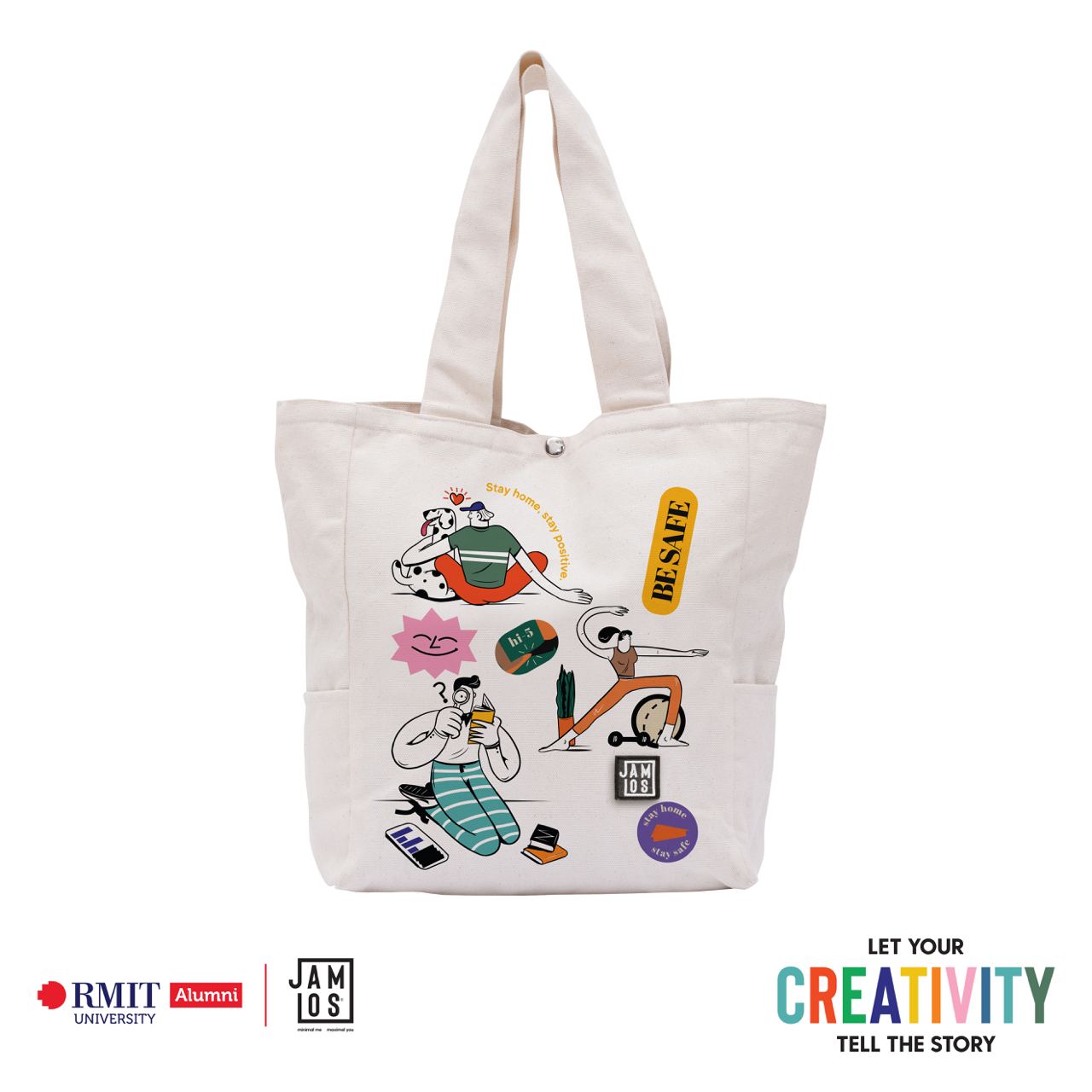
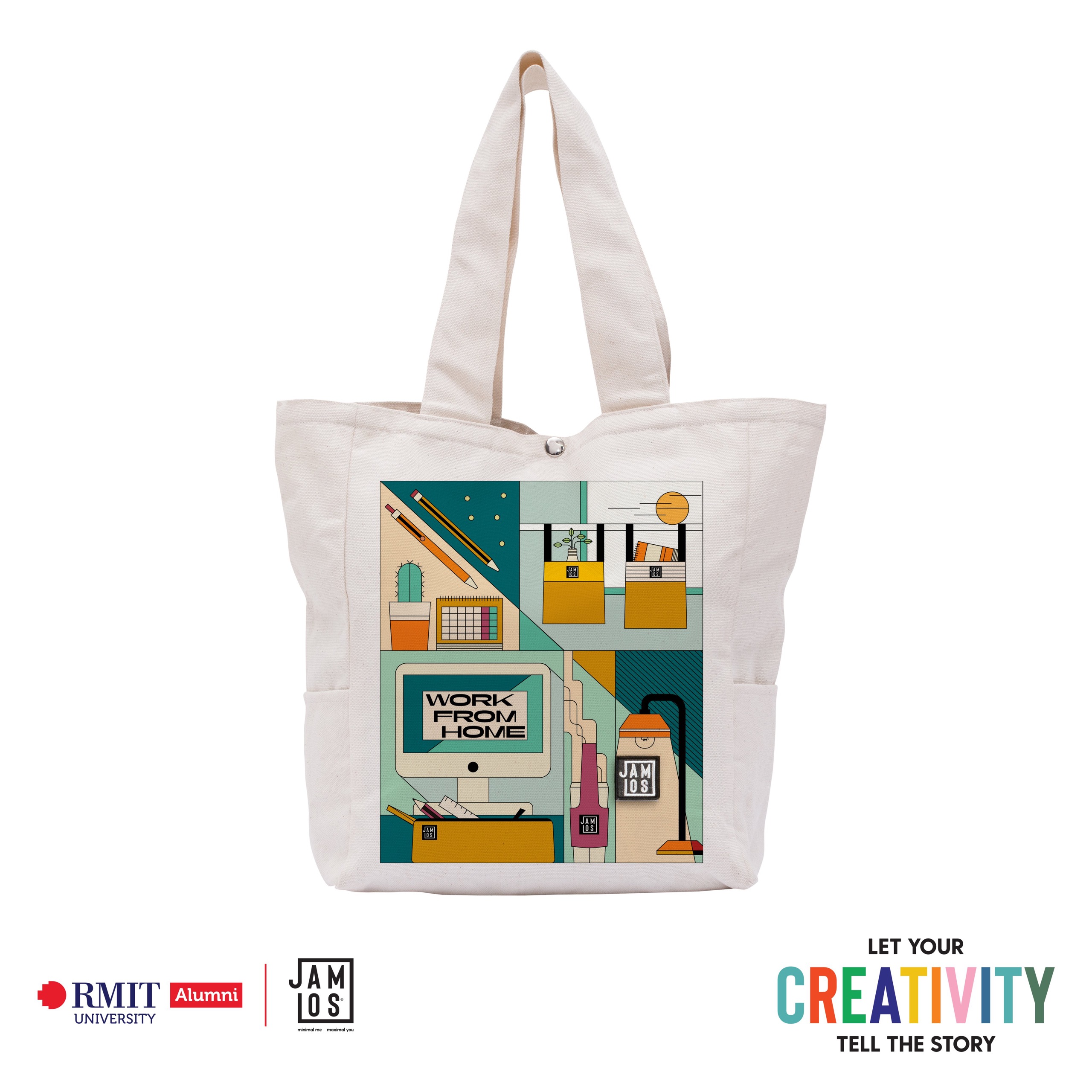
For my artwork, I chose the theme Work from Home. At first, not being able to meet my friends in real life for a long time and doing everything virtually makes me feel disconnected and worn out sometimes. But I also realized that this was a rare chance for me to slow down my living pace for a while. So, I started picking up my old hobby of reading books, trying to maintain a workout schedule and spend more time with my old dog. All of the things that I have been putting off because of my normal schedule. They gradually improved my well-being to stay balanced in the new normal and make work from home not so much of a hassle. By using a colorful palette and the illustrations of different individuals, I want to spread a positive message to young people who are feeling the same as me, to try connecting with your old interests/habits and stay healthy during this period!
Sai Gon Forever & Always
Typography
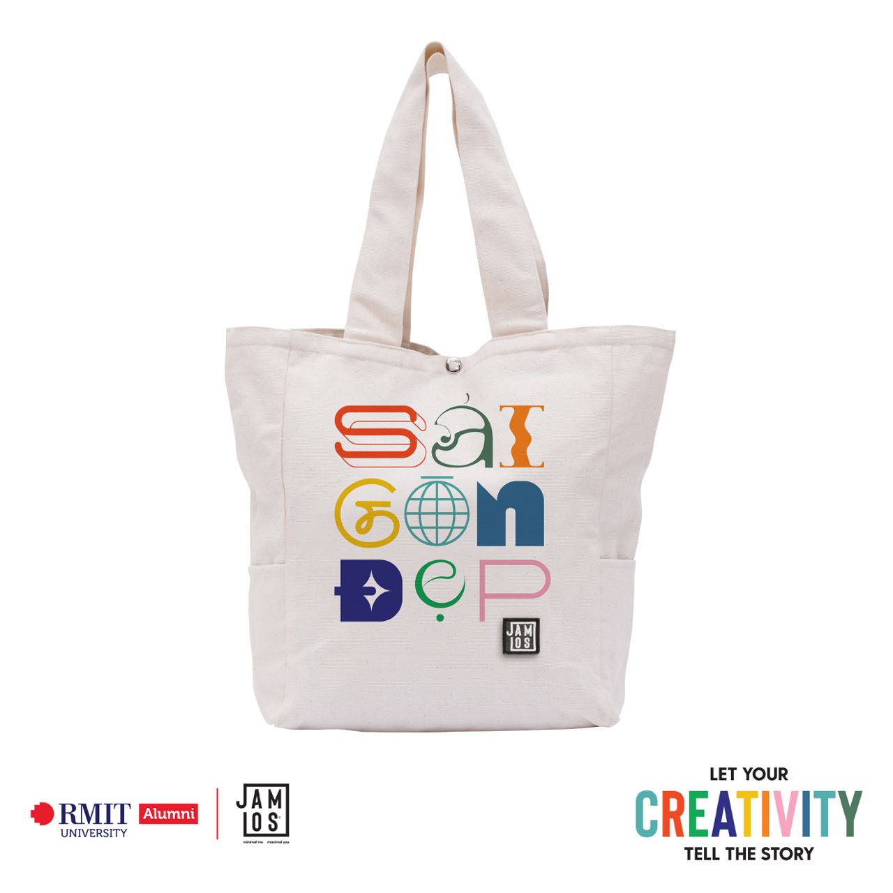
My artwork revolves around theme 2: ‘’Happy Living’’. I chose ‘Happy Living’ because my artwork aims to trigger and inspire positive feelings, although it also follows a minimalism concept. As you can notice, the phrase ‘Sài Gòn Đep’ is artistically centered with a soft color palette. I’ve been a Saigonese for pretty much my whole life. And more than ever before, I’ve viewed this contest as an opportunity to express my love for the glorious place that has always been welcoming and nurturing me all these years. Saigon itself is an elegant, classic, yet modern lady who is always ready to take on the world (represented through the globe element being at the heart of the tote bag). During this pandemic time, even though she might currently be in pain, yet, her beauty still shines through under no circumstances, and it forever will be. And that is also the message that I want to deliver and that I believe in. ‘’Sai Gon Forever & Always’ will stand a strong place in not only my heart but also in every Saigonese’s one. Stay Strong, Sai Gon! Stay Strong, Viet Nam!
Street Night
Graphic design
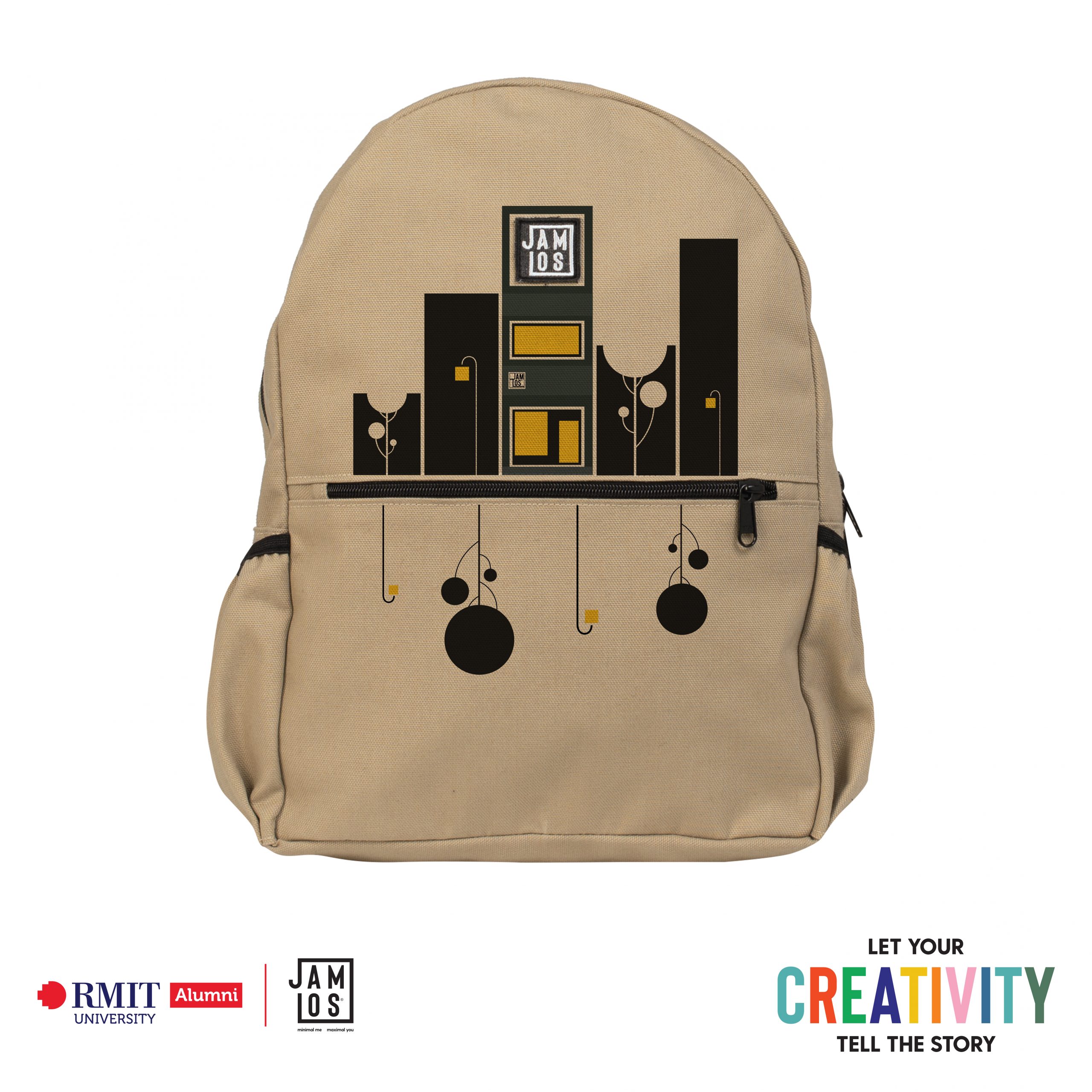
Walking down the street late at night, you notice not only the street lights, but also the lights of a store, all of which are a warm greeting on a cold night. This piece of artwork depicts a nighttime street scene with a JAMLOS store based on my imagination and a real JAMLOS store that was featured on RMIT News. It follows the theme of Street Life. Many design aspects are found in the artwork: There is a lot of asymmetrical balance in the middle between the four lights, the four trees, and between the JAMLOS construction JA block with the bottom components of the bag; between the JAMLOS shop and the entire lower half of the bag; Upper and lower contrasts, large and little contrasts, light and dark contrasts; For two lights in two blocks, use the rule of thirds; small-medium-big applied to bushes of trees; and negative space for the upper trees. I came up with the concept of combining the zipline and the bag’s logo as components in the artwork itself while brainstorming by sketching the bag on paper and looking around on Behance on four different topics. On paper, I drew numerous ideas: Zipline is the mouth, and Logo is the third eye; typography uses zipline as the ground between the upper and lower spiritual realms; the logo is the sun, and Zipline is the horizon line in Lion King, and so on. Then I came up with the idea of using the Zipline to represent the street and the Logo as a board on a brand’s building. Here are the Iterations highlights that I made during the process: – First digital piece: blocks on 2 sides of the zip and has colors, nothing special. – Added green trees, but the bushes are square. – Changed the lower part of the zipline into water reflections of the upper part, turning the artwork into a scene of a street beside the river. – I added many lights into the building blocks, and made light reflections on the water. Turning the piece into a more Paris, romantic view. – Realising the artwork was a bit too complicated, so I took a risky step and deleted the whole water-reflecting part, and deleted lights on other buildings except the middle store, making it the center focus of the artwork. – Turns the tree’s bushes into circle to smoothen the artwork, make it more unisex for the focused audience of the brand. – I starts applying design principles into the artwork, some are removed in the process – Asked my friends and family for feedback, asked them to choose between which design choice of mine is better, A or B. After 4 sketches, 16 digital iterations with feedback from my friends and family, I decided to finish the artwork after 5 days of making, from ideate to final.

FWB
Graphic design
In the Covid-19 pandemic, everything is going to be harder than ever. The chaotic street life in Vietnam has not existed in a long time after we all have to stay at home and keep safe. However, this is a time to live slower when people start to appreciate the simple things in the regular days like the favourite dishes in the morning and the gossip time on the street with each other. The term FWB begins to be transformed into favourite street foods of the cities on media conversation of young people during this quarantine period. This trend becomes viral when people alternately replace the name of the dish after the phrase “friend with ____”. To apply the graphic image with Street Life theme on the product in the positive vibe, I decide using signature Vietnamese elements to recall this whole moment of the pandemic time. Based on that, the product can easily be a part journey with customers in the future to keep the memory of us in this hard time that will be passed through soon: creative, fun, youth, mess and street food.
Work from Home
Graphic design
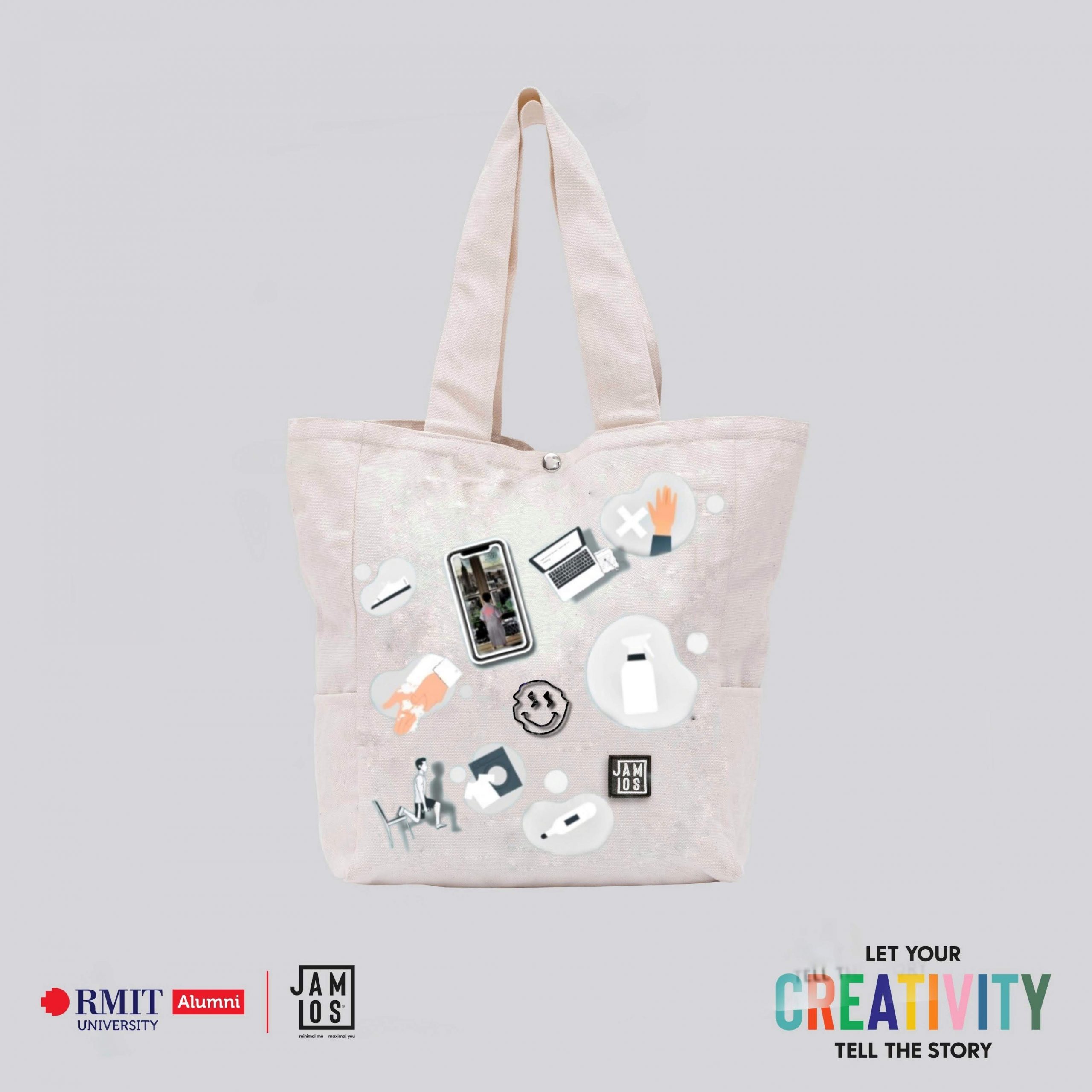
I picked the topic Work from Home for my artwork. Everything will be more difficult than ever during the Covid-19 epidemic. After we all had to stay at home and keep safe, the chaotic street life in Vietnam had not existed in a long time. However, this is a time to slow down when individuals begin to enjoy the little pleasures in life, such as favorite foods in the morning and chatter time at home with each other. During the quarantine time, the phrase begins to be changed into favorite city home meals on young people’s media conversations. This practice spreads when individuals alternatively change the dish’s name after the term buddy with.To apply the graphic picture with the Work from Home theme on the product in a positive feeling, I decided to use characteristic Vietnamese motifs to recall this entire epidemic period. Based on that, the product can easily be a part of a future journey with customers to keep the memory of us in this difficult time that will be passed soon: keep your shoes outside, don’t touch anything in the house, disinfect your bags, check your body temperature, wash your clothes soon, wash your hands.
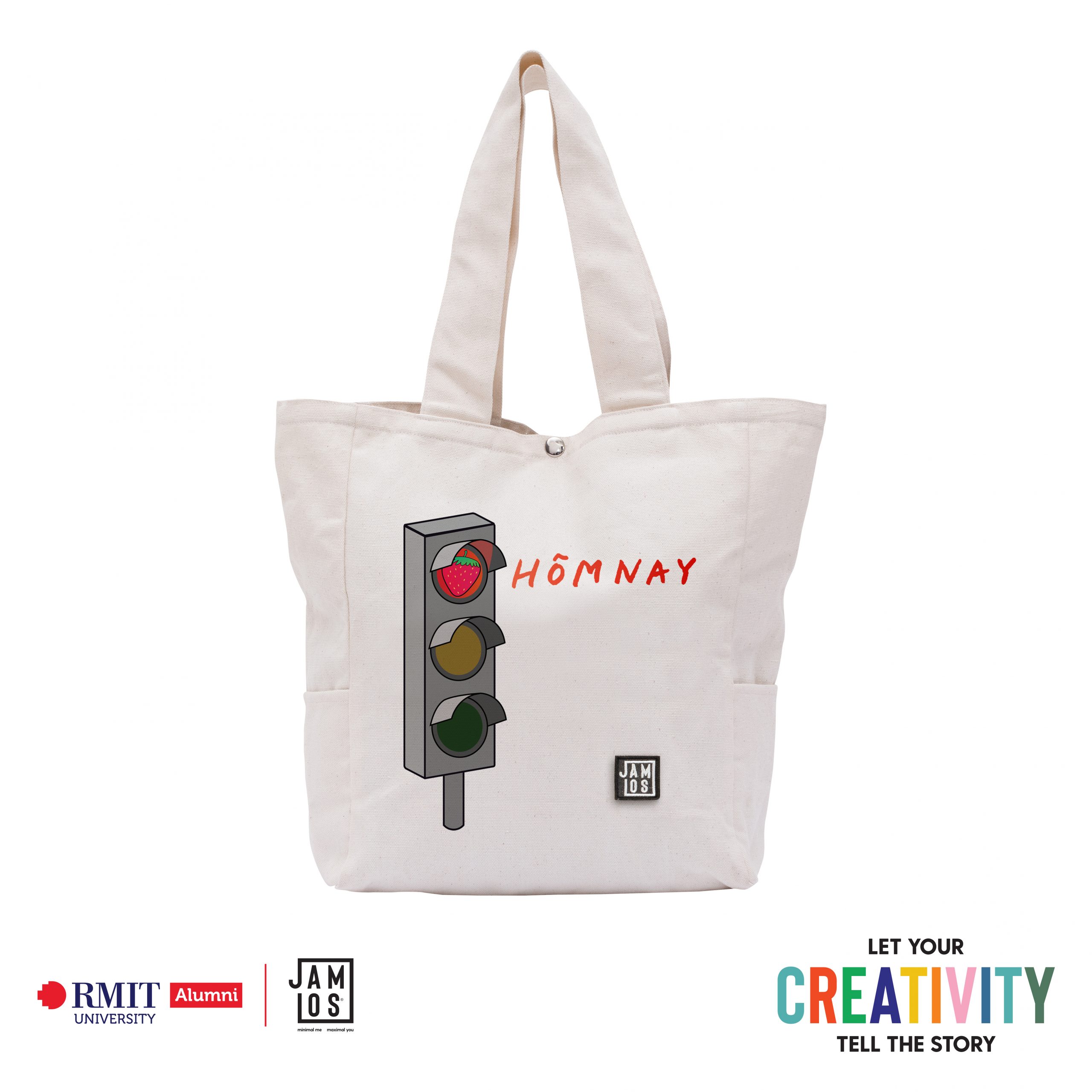
Dâu sucks, giấu?
Graphic design
Every month, I see my mom, younger sister and friends struggling with periods. But they still manage to work and study like any normal day. For some people, it’s so physically painful and upsetting at once that they can’t talk to other people about the situation. So how can we help them express their health condition without saying? I came up with the design of traffic lights with strawberry on red light and the word ‘Hôm nay (Today)’. It combines two Vietnamese colloquialism about “undergo period” – “rụng dâu” and “ngày đèn đỏ”. For example, a woman can go to work showing the tote’s other blank side, and if anyone asks her how she felt, she will flip the colored side and point to the image. Even when showing the colored side, the design is minimised with small-scale key detail to stay humble within the outfit, as it serves the communication purpose rather than an elaborate accessory. That’s why I categorized it for the “Happy living’ theme, I just want to help women in my life to be comfortable in those days.
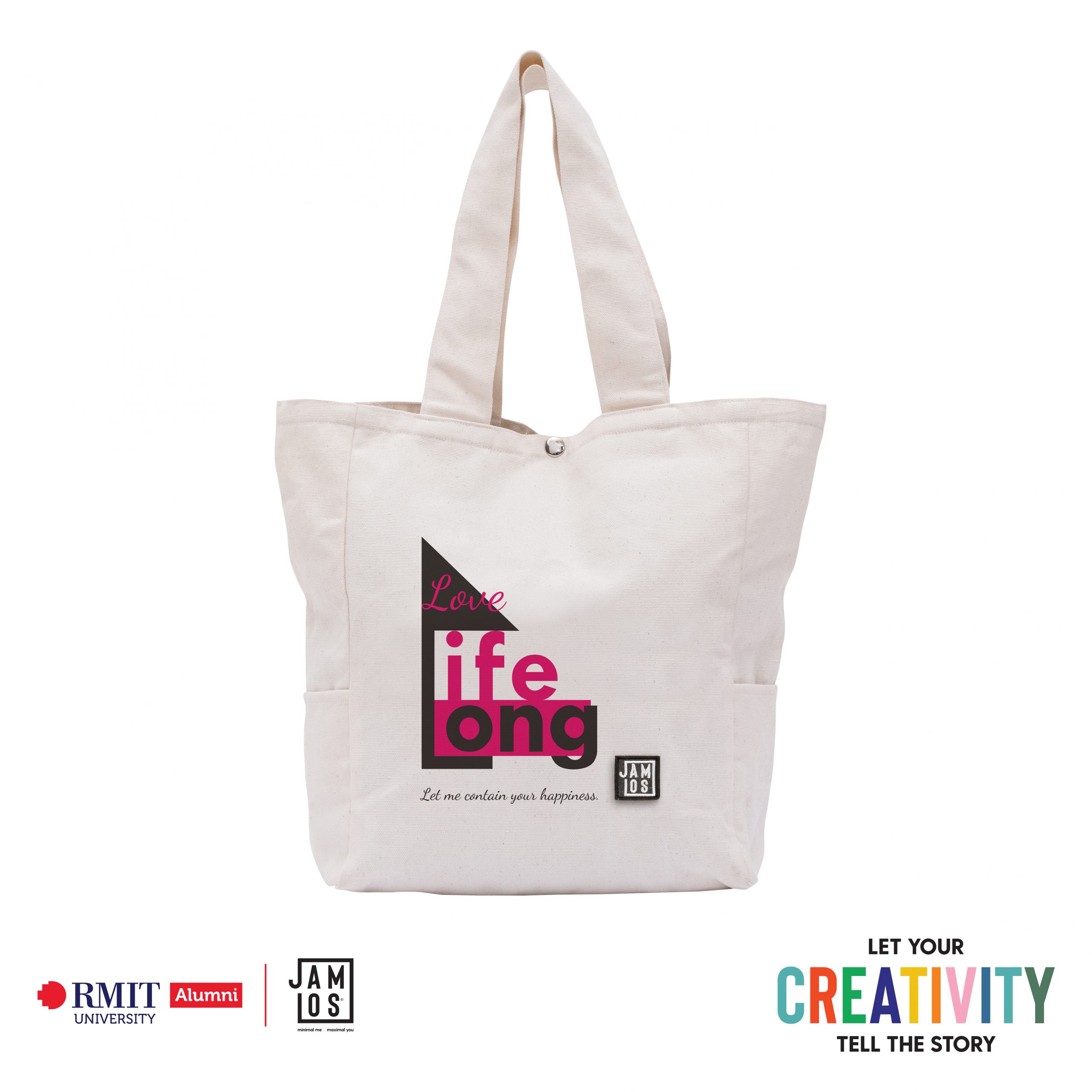
LOVE YOUR LIFE LIKE YOUR HOUSE
Typography
My artwork is generated around the relationship between love and life. In this case, I use three words: LOVE – LIFE – LONG with two directions of meaning. LOVE – LIFELONG: the first meaning is love lifelong (all your life is full of love). Your life is the same as your house. If you build your life full of love, you will live in solid pink. When people gaining and giving love to their parents, lovers, friends, colleagues, and also love themselves, they will live in positive emotion. Thus, their life would be happy and steady. My design is a combination of soft and solid. I use Script typeface to represent the softness of love. When life is built with love, it becomes more solid. In this circumstance, Sans-Serif typeface is the best choice for LIFE – LONG. Looking at my artwork, you can see the character L constructing a house and the layout of all the elements is inside a square triangle. Those elements are followed my intention to approach the idea: Treat your life like your house. At the bottom of the artwork, there is a line of text indicates that you should collect your love to build your own house by using this JAMLOS’s tote bag. LOVE – LIFE – LONG: the second meaning is prone to a message: When you love your life, you will stay long. As I mentioned above, loving your life will bring positive power to push your life more meaningful. You can not live long when your life is sinking in black. Specifically, we are living in the COVID-19 pandemic period. Our life has to be put into priority. So, love in this case is more about love yourself. Please stay at home to build your life, make your life longer. Having a chance to bring my message to society through the JAMLOS x RMIT design contest, I hope people start to collect love to build their life from now on. One of the easiest ways to find your love is to love yourself. Try to stay at home and follow the instruction of the Government to build “YOUR HOUSE”. If you find it difficult to do that let me and JAMLOS help you to collect it with this magical tote bag.

H O M E
Graphic design
The first time I saw the topic ‘Street life’, I immediately asked myself “what was the street like these days?”. As you can see, due to the severity of the covid19 pandemic, the street we live in today has changed a lot in few months. It is quiet and deserted, people go outside not for shopping, or hanging out, but to buy food stock, get vaccinated, and ship products. Therefore, I decided to illustrate those typical activities to bring a comprehensive view of Vietnamese streets and Vietnamese people during the quarantine. The reason why I chose the frog as the main character instead of a human is that it is one of the most trendy and favorite characters of many artists and teenagers, we can clearly see on Youtube which artists create it with clay and turn it into rings or jewelry holders. The fact that JAMLOS is a brand which was made to meet the need of young buyers so I think if I use that character, besides the reason of making the product more adorable, I hope it will help to increase the popularity of the product. When I finished sketching, there was still something missing on this street and I finally realized that after reading the quote which many people shared on Facebook: “Sài Gòn hoa lệ, hoa cho người giàu, lệ cho người nghèo” I felt like I nearly neglected the people who are living on the breadline and struggling hardly through this difficult time, everyone lives on the same street but each of them has a separate life. So for the last piece, I added two more frogs but place them in the hidden corner and put them behind the dark blue shadows. With these two characters, I use different color tones and different positions compared to the others so as to show the gap between the rich and the poor. The last message that I want to convey through this artwork lies in the typography, I made the road by combining each letter together; starting from the letter H on the left, letter 0 is a frog’s hospital, letter M is stretched from left to right and leading to the letter E. Those letters were made to form the final word “HOME”. We all know that “Stay home” is one of the most necessary reminders in this present time. After spending a busy day on the street, home is the safest and happiest place to come. Come home and stay home, is the sweet message I want to give to people who will carrying this tote.

Stay Home
Typography
When I saw the title “let your creativity tell the story” I spend nearly a day thinking back and forth of what kind of story I should tell, apparently they say the best stories often comes from memories as they have the strongest emotional attachments. I miss the times strolling along the beach during the golden hour on the motorcycle before the pandemic hits. I immediately start picturing my memories on paper h for a while before coming across the news about the pandemic situation in Vietnam. I suddenly feel enraged by the news of such ignorant people violating social distance laws, infecting other people, making their lives more difficult and even lengthening the distancing period. It’s because of these people life has become harsher, for me, for them and for the others. I decided to scrap wat I was doing and start to come up with a graphic piece as a message for the pandemic period. The message “Stay home” is simple, well-known but effective. The letter “A” has the shape of Bitexco building, an iconic building in HCM city. I decided to illustrate the image of HCM city as an encouraging message for a fast recovery from the pandemic dedicated for the big city, i miss HCM city, i miss the urban vibes, i miss my university. Stay home people!

No thanks, pants!
Graphic design
Working from home is awesome, right up until the cat throws up on your computer. And your neighbor, who you can only assume is building a time machine, starts firing up all sorts of power tools and noisy machinery across the hallway. I find that it’s easy for me to become my own worst enemy because without coworkers around, I’m free to drop those pesky inhibitions. At the home office, no one’s watching. I don’t necessarily feel that same peer pressure or communal obligation to get stuff done. (And no thanks, pants, I’m working from home today). However, as an artist, I find this time so precious for me to draw more regularly and have time to discover my inner self. After many times researching about Jamlos, I appreciate the way Jamlos embraces minimalism and convenience in their products. Hence, I decided to execute my artwork in lines and only use the black color to demonstrate my work-at-home life. I believe that, with line art, this product will be more approachable for youngers, especially Gen Z because of its simplification. Also, the idea of black and white tote bags can be easily mixed and matched with every kind of daily outfits. Another captivating point about Jamlos products is that Vietnamese culture is incorporated and glorified in their concept. It can be easily seen through their ‘SG-HN Tote bags’ by shouting out to Hanoi and Saigon, two economic centers in Vietnam. Therefore, I want to emphasize Vietnamese cultures in this collection with flower tiles so that the Vietnamese will feel more relatable to this product. All in all, I believe that the combination of minimalism, convenience, and cultural orientation will create an Intangible product for everyone. Additionally, I hope that working remotely can give us the time and environment needed to make healthy choices.

Happiness Is a Choice
Typography
There is a meme spreads across Gen Z community: whenever in doubt, Gen Z seeks the answer from the above through Tarots. To be honest, tarot is just an advice. The thing that matter enough to lift your mood today is your decision. Follow the arrow or listen to your guts- it is up to you. Climbing over a mountain to see spectacular twilight or staying inside to treat yourself to a lazy hazy day are both fine. As long as you feel happy with the result based on your decision, all experiences are joys. The key to happiness is your decision. “Happiness is a choice”.

WFH Starter Pack
Graphic design
Since the beginning of the pandemic, for the past 2 years, the concept of “Work from Home” has become more familiar to all of us. During lockdown, no more 9 to 5 work in offices, no more daily face-to-face meetings, no more traffic jams or weekend hangouts at the malls. Everything, be it working, eating or entertaining, now happens inside our home, where we usually feel comfortable and sometimes overly relaxed. Thus it might be hard to keep up with the normal daily schedule and we might easily fall into the habit of procrastination, staying up late, watching too much Netflix and so on. I think in order to work from home efficiently, we need to form good habits and try to maintain a healthy lifestyle so that once the lockdown is over, we can get back to “The New Normal” in good shape. Therefore, the idea of a “work-from-home starter pack” come into my mind as a great message to everyone during this time of pandemic. Since it is the “starter pack”, it conveys the most basic but key staple of a healthy work-from-home lifestyle, both mentally and physically, including: healthy diet, exercise, good night’s sleep and effective working. I chose the cat as an illustration for my message because I feel like when we stay home for a long time, we start turning into indoor cats, who nap, eat, stretch and play all day within their safe haven, aka the home. Moreover, since Jamlos’s customers mostly are youngers, I think the adorable image of cats may attract them to buy the tote bag, should the design be chosen. In short, my “work-from-home starter pack” design is a reminder and express my wish for everyone’s health, happiness and positivity during this hard time.
Happiness Is a Choice
Typography
There is a meme spreads across Gen Z community: whenever in doubt, Gen Z seeks the answer from the above through Tarots. To be honest, tarot is just an advice. The thing that matter enough to lift your mood today is your decision. Follow the arrow or listen to your guts- it is up to you. Climbing over a mountain to see spectacular twilight or staying inside to treat yourself to a lazy hazy day are both fine. As long as you feel happy with the result based on your decision, all experiences are joys. The key to happiness is your decision. “Happiness is a choice”.
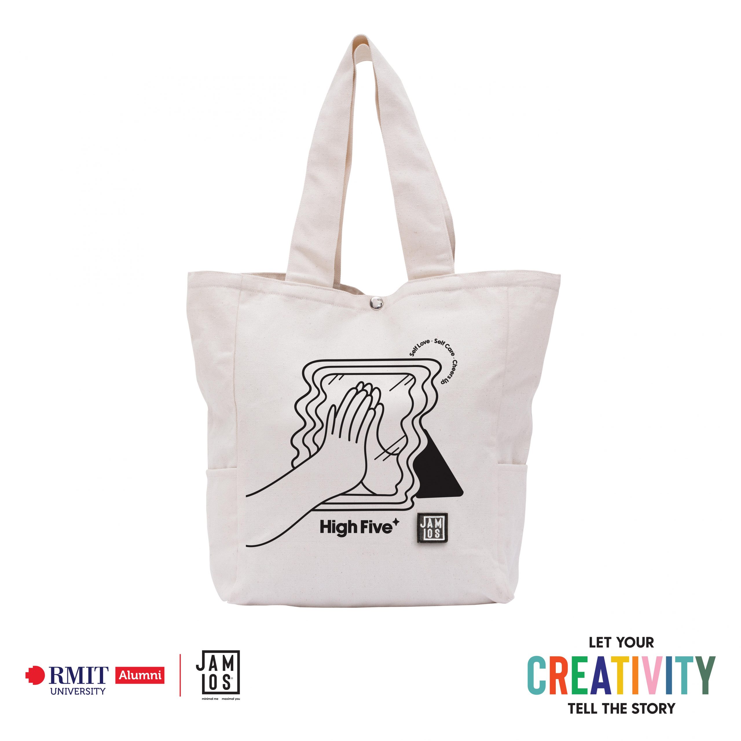
Self-love, self-care and cheer up
Graphic design
We and our world live in the complicated days of the COVID-19 pandemic. The approach to some of the most critical aspects of the emotional response to the pandemic have radically changed. Thus it is a pivotal component to take care of yourself, stay possible, and be humble as well. The terms of this concept, “Self-love, self-care, and cheer up” are essential to our emotional self-health care and well-being. The COVID-19 has altered our daily routines; let ourselves continue to be optimistic and strive to better each day.

Work From Home?
Graphic design
There’s a question spring to my mind when I read the topic: what if the concept “work from home” is not all about working on any particular job, but rather, working on yourself. In this pandemic, I have formed myself a new habit that if I can still wake up to another day, I have to appreciate every second of my existence and make the most out of that day. Acknowledging that Jamlos is a brand that focuses on customers that have a minimal and green lifestyle, I try to bring my personal approach to this calm spirit into this illustration. My artwork is about a person leaning on that healthy lifestyle – Jamlos logo, quieting the mind, and just truly being at the present. That person is investing in himself, letting the light of the heart and nature engulf his body and soul. His body becomes more tranquil than ever, which allows dreamy space and stars to pour in. And his garden harmoniously filled with all those plants and flowers (which were picked to represent the inner peace: cactus, snake plants, peace lilies, daisy, carnation, etc) starting to grow and bloom. At first, locking down really makes such an extrovert as me feel lost, I forced myself too much on staving off bad feelings about this situation. But then, I realized that peace is not about escaping, but rather, it means being in the midst of everything and still able to feel calm and enjoy the idyllically and lifely scent. By using a childlike and joyful color palette as well as a sketchy hand-drawn style, the artwork looks like it was drawn out from a children coloring book. And this is my design, a tote bag with a friendly illustration for everyone’s inner child, delivering a positive call-to-action message: start your day with a smile on your face and kindness in your heart. Just let your consciousness guide you ahead, don’t let the hustle lead you astray.
Your choice
Graphic design
During the COVID pandemic, working from home is something we may struggle with at first but it may end up with wonderful results depends on how we choose to live. At first, it might be hard to work with an unusual daily routine, no more face-to-face meetings, no chit-chat with buddies at the coffee shop, no more tasty street food. Staying at home for a long time might make you feel stressed and isolated, especially when you have no one to talk to. Therefore, through my artwork, I want to share some beautiful moments of life to encourage people to try a new routine during the quarantine. Try to spend more time taking care of both your physical and mental health by healthy diet, effective working and trying new hobbies. Moreover, by using simple illustrations together with a bright, warm tone color, I want to bring a cozy, bright vibe to boost customers’ mood. All in all, I believe that when having a positive and suitable daily routine, you can enjoy the special time when staying at home during the COVID lockdown.
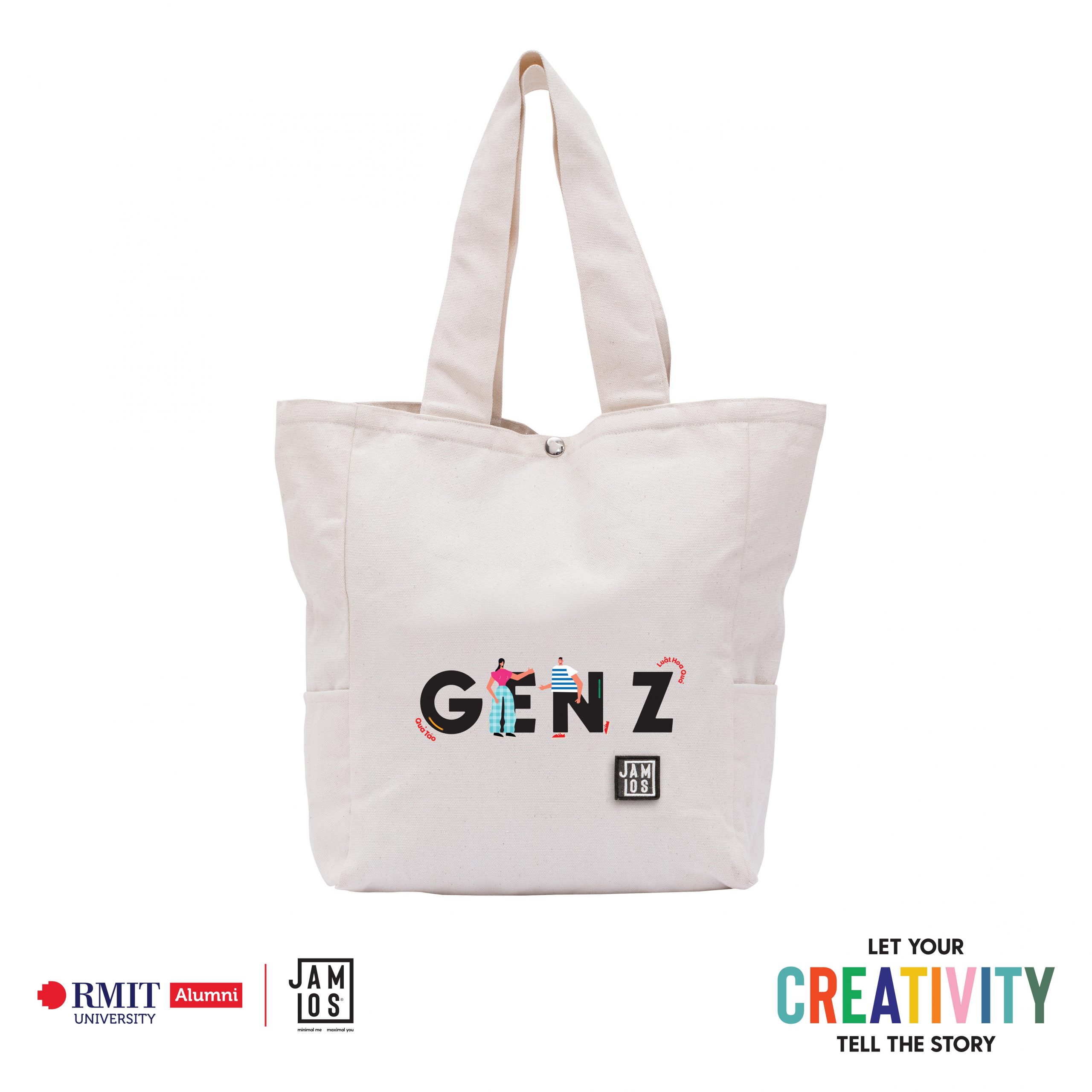
GEN Z
Typography
Gen Z is known as the demographic group that falls between Millennials and Generation Alpha. One of the significant parts that thrive in transforming and constructing a developed society in the future is predicted to be the combination that digitizes and works economically. The concept of “Gen Z” and the amusing quotes will be eye-catchy to young people with familiar famous comments recently on social media. The character in Gen Z presents agility and flexibility in communication and working, and there is no border to limit themselves.

Awkward Silence
Graphic design
Awkward Silence is about a situation that I frequently come across when studying and working online. This happens when one person is presenting and asking a question but no one replies and the worst part is the presenter cannot even see people’s faces to decide what to do next. This situation can be very upsetting but at the same time it can also be a funny and unforgettable experience.I believe that anyone that has been in any online meeting has at least one time been in this situation and therefore, I decided to create this graphic for the theme Work from Home as many people can relate to this scene. I have also read about Jamlos and know that the brand follows the minimalism style so I decide to keep my artwork very simple.
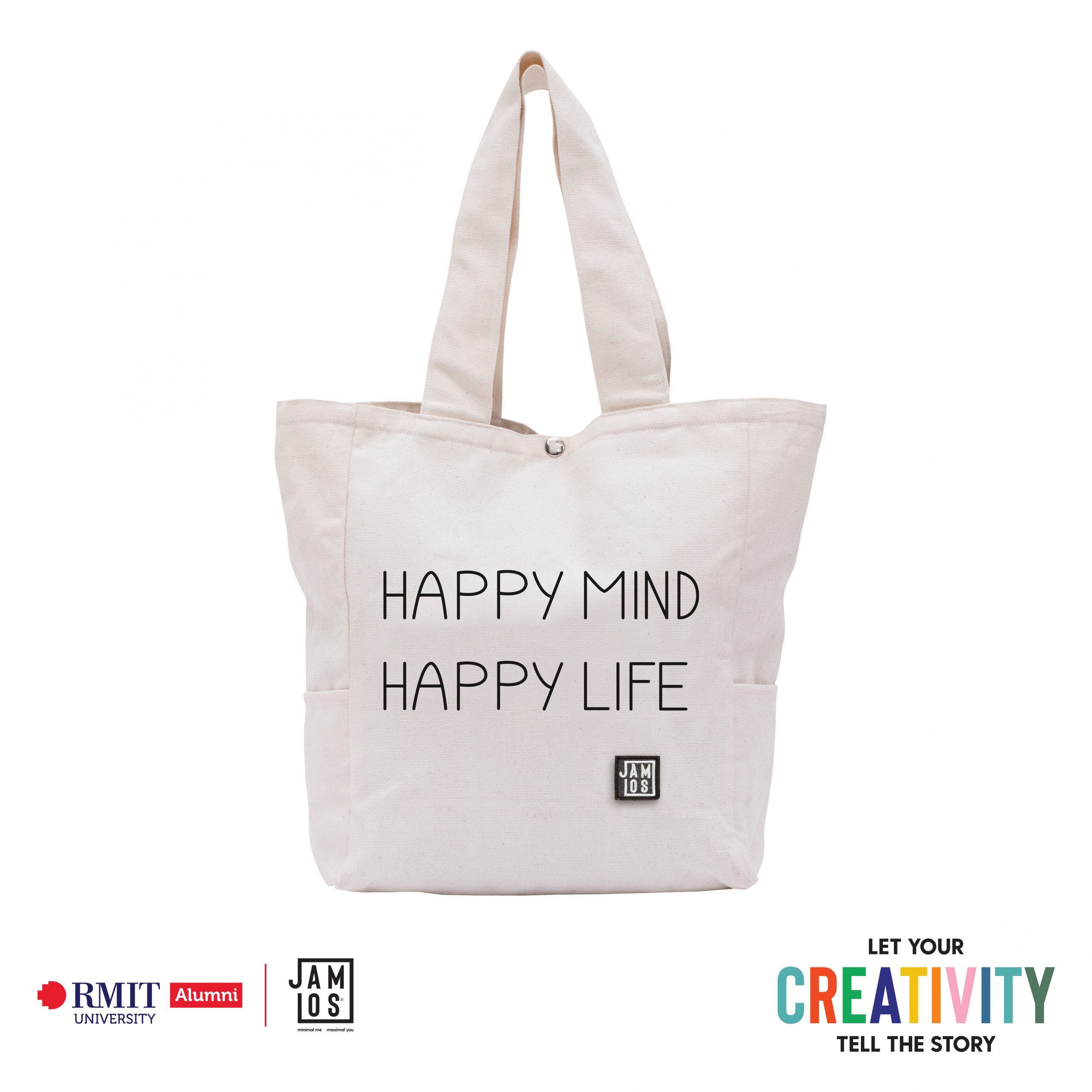
The Present
Typography
The Present is created for the Typography categories and follows the theme Happy Living. In the situation of Covid-19, many unexpected things can happen so I have created the typography of the quote “Happy Mind, Happy Life” to remind everyone that although it is a tough time and it is not easy to always be positive but try not to overthinking, get rest if you feel overwhelmed, be grateful for what you are having and live for the present. It is important to remember that “we cannot always control what happens outside of us but we do have control of what happens inside of us”. I created the typography with very simple lines to fit with Jamlos minimal style.

Dậy Đủ Xài?? Dậy Đủ Xài.
Typography
I always admire people who pursue a minimalist lifestyle. They always have their priorities straight when it comes to possession, especially the acquisition of new items. Minimalists know what their needs are, and especially they know when to say “That’s enough!”(certainly something I should say more often). Inspired by and aspiring to highlight the minimalist lifestyle as well as make it accessible and comprehensible for Vietnamese people, I come back to the phrase “Dậy Đủ Xài.” (“This is enough to use.”) Grammatically speaking, the spelling should be “Vậy,” not “Dậy”. But being born and raised in the south, I always pronounce the “V” /vờ/ as “D” /dờ/, and I’m sure a lot of people would relate to this. On the other hand, I also find the younger generation (Gen Z) , such as myself, are attracted to a fashion product with a short, straight-to-the-point, almost blunt statement with a clear message. Therefore, I believe that the regionalization as well as the one-line delivery would help bring the product closer to the users. Finally in a way, the saying also means: With my one amazing Jamlos tote bag, I got everything I need 😉 DẬY ĐỦ XÀI!! The opportunities are endless!!

WFH – World From Home
Graphic design
Over these past few months, Vietnam has been suffering from the furious outbreak of COVID-19 across the country, causing unimaginably empty streets and fostered an alternative reality of remote working. Witnessing the ruthless and disheartening changes, I have faced an overwhelming disorientation—almost hopelessness—as I desperately look for the end to this pandemic and its damages. When thinking about my career in the future, one question arises: Need I Work From Home (WFH) forever? As my devastation grew, the WFH abbreviation unfortunately started to develop a negative connotation. Yet, I feel strongly a wish to tackle such negativity and change the narrative. I want to make a pun out of the abbreviation, and I want to spread a message of positivity and hope. That is why “WFH” to me no longer just means “Work From Home,” but it’s now “WORLD FROM HOME.” I do count myself as an extremely fortunate individual for having access to resources around the world telling me that there’s light down the tunnel. To pass on that message, I want to create this design as a reminder to many people who are working from home right now, that you can still see and connect with the WORLD From Home (yes, pun intended). Taking inspiration from Google Maps, I turned the “World” into quite a literal destination to travel to from my “Home”. To reach such a destination, there are 3 modes of transportation: Dreams, Donations, or Books. In this case, Dreams refers to dreaming of better upcoming days, which can be reached by counting 100 sheeps. Donation includes caring for those who are less fortunate as a way to reach out to the world. Lastly, Books serve as an infinite source of knowledge that can help you educate yourselves in this dire time. I do hope that you too, whoever is reading this, can pick up the message, and find a “transportation” to take you to the “World” From Home. Stay inspired with Jamlos!

Sống Vuiii with Jamlos Ü
Typography
“Happy Living” directly translates to “Sống Vui” in Vietnamese. Taking inspiration from that, I wanted to take that tagline and create a design in Vietnamese, for Vietnamese, and hoping that a prominent Vietnamese brand, like Jamlos, would take on the Vietnamese pride with me. About the design, I integrated the word “Vui” (Happy) into the word “Sống” (Living) to challenge the viewers to find “Vui” in (cuộc) “Sống” with me. That is also my exact message with this design, because there would definitely be times in our lives where happiness wouldn’t be apparent, and you would have to dig deep, and quite literally LOOK for it. But happiness -“Vui” would always be there, it never fades; we just have to be persistent, and are actively on the lookout for it 🙂 I want the design to pop out, as if it is screaming to tell you to “SỐNG VUIII”!! Hence the design’s ambiance, and artistic details. But just in case the message got lost in translation, I have a little smiley face intertwined with “U”, because “yoU” makes the U smile (Ü).
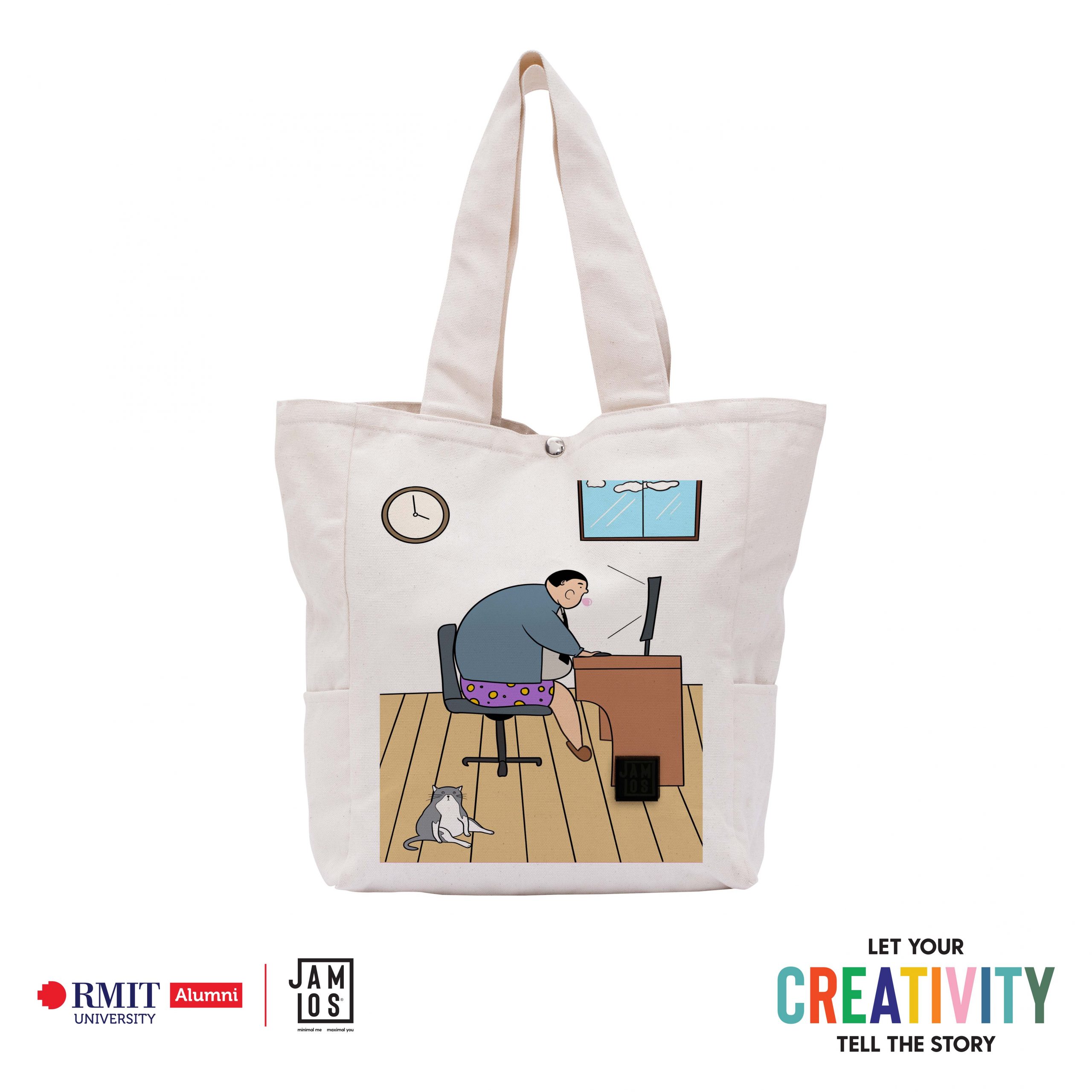
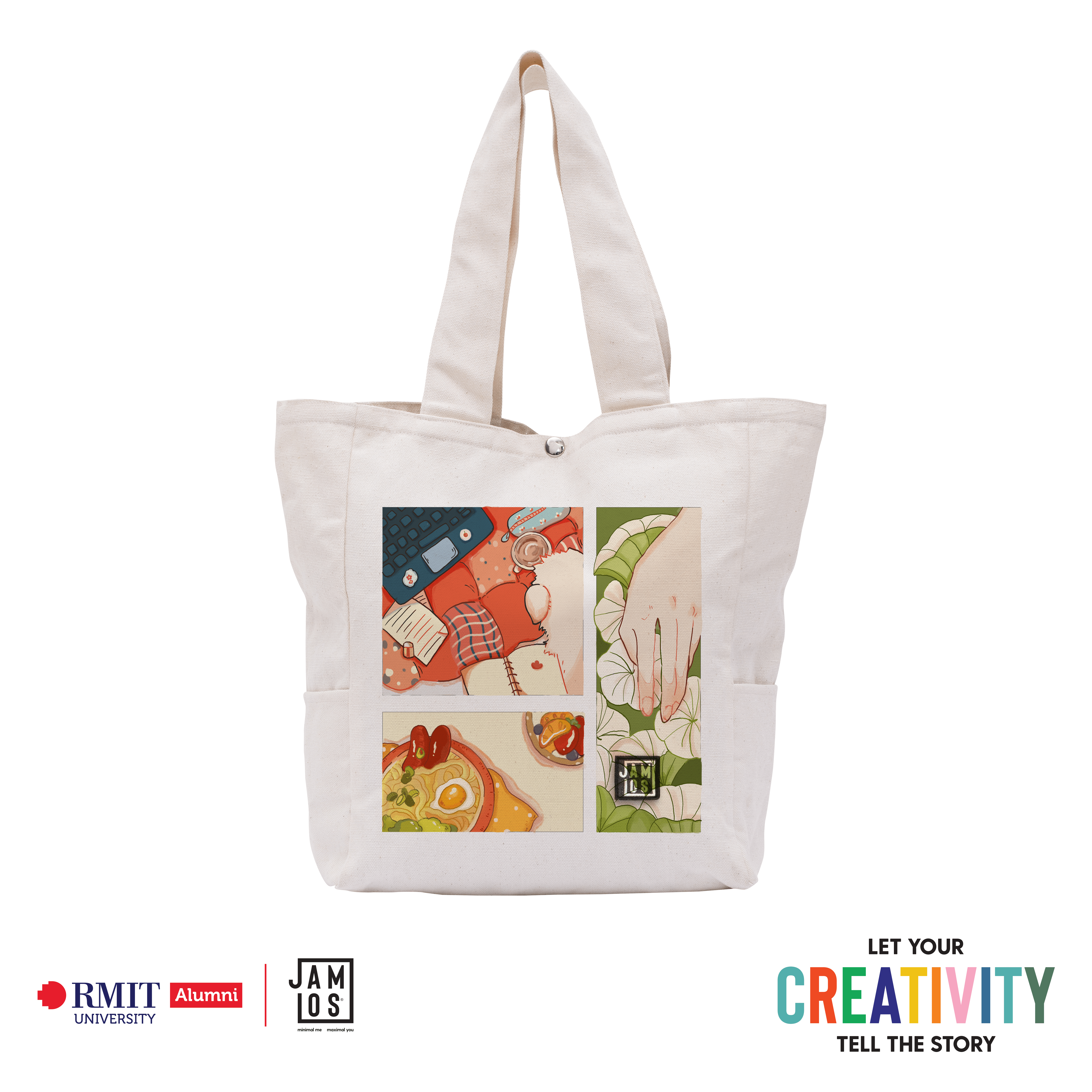
A normal working day
Graphic design
During the pandemic period, everybody has to move from their normal work life to start working from home. My inspiration for this topic comes from my daily working routine, and some references of other people working from home on the Internet. The image of an overweight man sitting in front of the computer is the image of many people in the pandemic as they can not go to the gym or doing exercises outside. Another thing is how people dress at home. At the top, they can put on a very professional suit to join a meeting online, while wear random pants that they normally wear at home. I think that it is a funny yet unique feature that only in this time do we experience in this unprecedented time. Although working from home may bring many disadvantages for most people, at some points it gives us our own space and flexibility to work comfortably.

Cà Rịch Cà Tang
Graphic design
What are the first things that flicker on your mind when you are thinking of street life? Some people would say iconic buildings and motorbikes. As a person who works from midnight to dawn, the beginning of the day is the most defining scenery of street life (to me, at least). A new day starts on the pavement with a cup of fin coffee, a paragraph of news and a red plastic stool. Joining with some old pals or all by yourself is still okay, chilling before the city get crowded is that much matter. The street restarts its life cycle with no bells and whistles. “Cà rịch cà tang”. Easy it is.
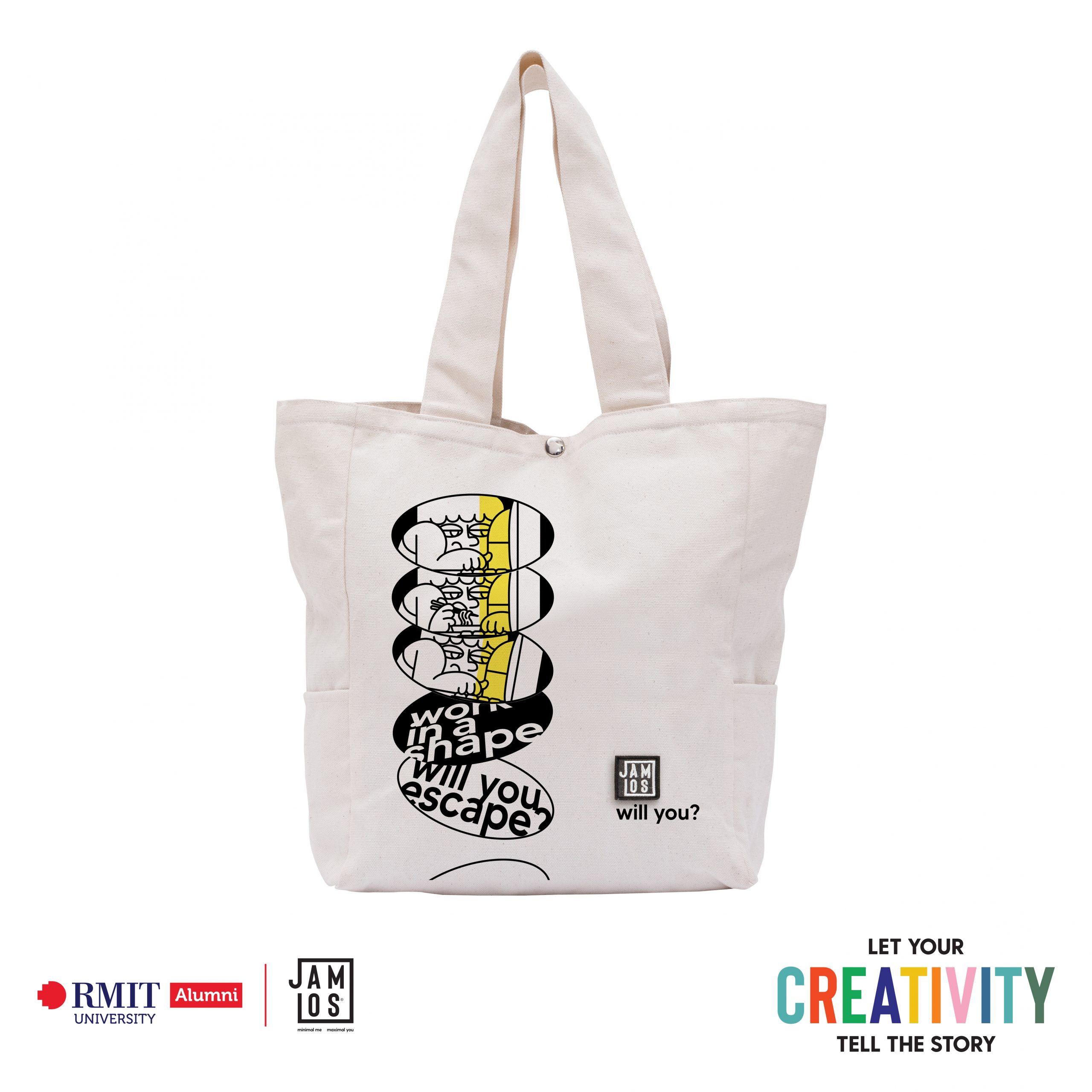
Work in a shape – Will you escape?
Graphic design
During the pandemic, everyone is staying at home. Imagine you get to see what you have been doing all the time. What do you see? You witness that you get up at 8, get to your laptop to study/work, go to the kitchen to cook some noodles, bring the noodles to the computer and eat while working to deadlines, go to the restroom, come back to the computer, and spend your whole day in front of your computer screen. You are working in that shape of the computer screen. Usually, ‘in shape’ means being in a good state. But in this case, is it still a good state? Do you want to escape from the shape, or you just let it be? About the concept, I want to let it as a question because I want us to reflect to ourselves and think: ‘Am I doing it right for my body and my mind?’. Whatever the answer is, I believe that everyone has their reason and knows what is the best for them. For the visual style, I tried to make it limited with only black and white space because I know Jamlos follows a minimalism style. Also, the yellow represents the light from the computer screen as it is the only light source in your room.
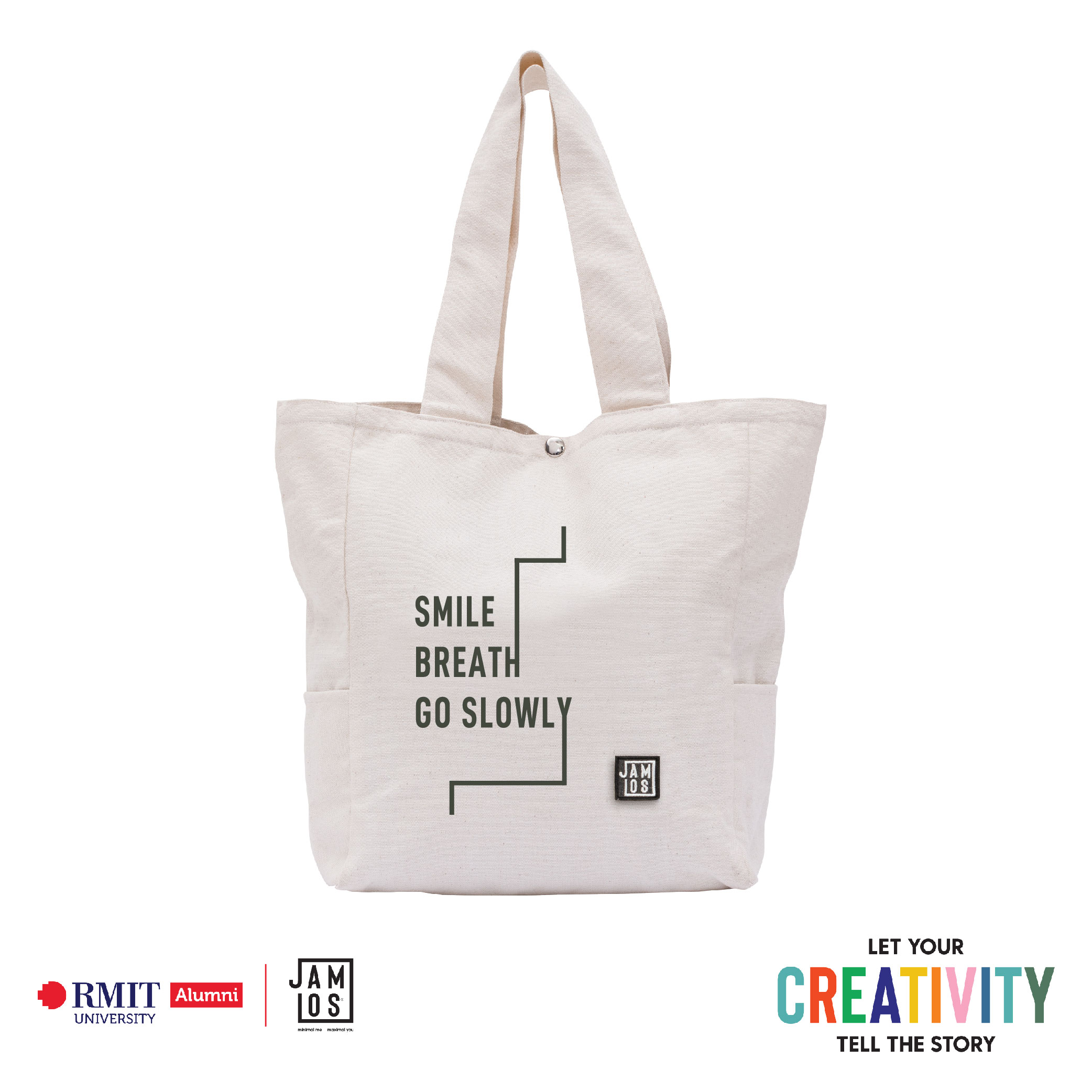
Smile, Breath, Go Slowly
Typography
In the time of the Covid-19 pandemic, one of the things that most people ever desire is perhaps going outdoor to inhale the air, walking around the street freely and getting back to their normal lives. With a profound sympathy and understanding of that wish, my artwork was born as a combination between the concepts of Minimalism + Home Quarantine. Firstly, after a long while branstorming + doing research on different things found out from the chosen theme, I produced a typographic artwork consisting of the famous quote: “Smile, Breath, Go Slowly” from Zen Master Thich Nhat Hanh, a Vietnamese Thiền Buddhist monk. The quote is succinct and correlates with the true definition of the “Minimalism” concept – To strip everything down to its essential quality and achieve simplicity. Following a Minimal lifestyle means that you’ve choosen a life that is not materialistic, but carries heavy spiritual meaning, to lead a simple life but reach its highest mental quality. That ideology can be perceived through the quote, and it is specifically meaningful in this era when “staying at home” is a must. I wanted the audience to focus on the message so I kept the initial artwork’s idea strictly follow Minimalism plus Graphic Design rules, no flamboyant styles. It is a replica of the “Jamlos” logo regarding the typeface chosen, the placement on the bag and the alignment of the text. Later on, I deepened further into the theme and produced more design ideas. Inspiring by the Minimalistic artwork of artist Agnes Martin, together with idea of “Quarantine at home” due to the pandemic, a mood-board for conceptualization was created. I combined the previous ideas that I had because I wanted to see something more “breakthrough”, exploring what can be seen beyond the “blank space” which is very typical for a Minimalism-based artwork; and beyond the framework, the tedious vertical and horizontal lines of four walls of a “Home”. And there goes the Outcomes, which follow the rules of Graphic Design as strictly as we must “stay at home” in this time. The vertical and horizontal lines symbolize for the “house” that we must stay inside. I did these by manipulating the characteristics of Typography effectively following the concept of minimalism. However, as people have always wanted this pandemic to be over so that they can go outdoor and get back to their life again, the lines in my Final outcome direct outward to represent that desire, the desire to be “free”. They also make the artwork look more “dynamic” compared to the other versions. More over the that, there is an accusation of those who break the law to escape from quarantine indicated abstractly through the artwork, just by using very simple and “minimalistic” lines and typographic style.

Everything will be OK
Typography
Our world has been thrown into chaos by the pandemic, yet it cannot keep us from living happily together. I created that Typography to spread positivity to individuals all across the world, particularly doctors and nurses in Vietnam as they’re directly help us fighting with this pandemic, they had to sacrifice many things, so I just want them to know how appreciate and respectful I feel for what they have done. Stay Positive – Be Negative, or even Stay Negative – Be Positive, no matter how you read them, those word-play all indicate the same meaning: be positive, joyful, and productive during this time, because we’re strong, emotionally, mentally,… we don’t give up in these hard situations, beside being active, happy,… we also have to be careful, don’t be negative with Covid-19. That’s would be tough for all of us. “Negative” is black and upside-down also symbolized for the difficulties will be beaten, the orange made the “Positive” stands for a bright future. I wish all of us will be safe, and we will get over this as soon as possible!
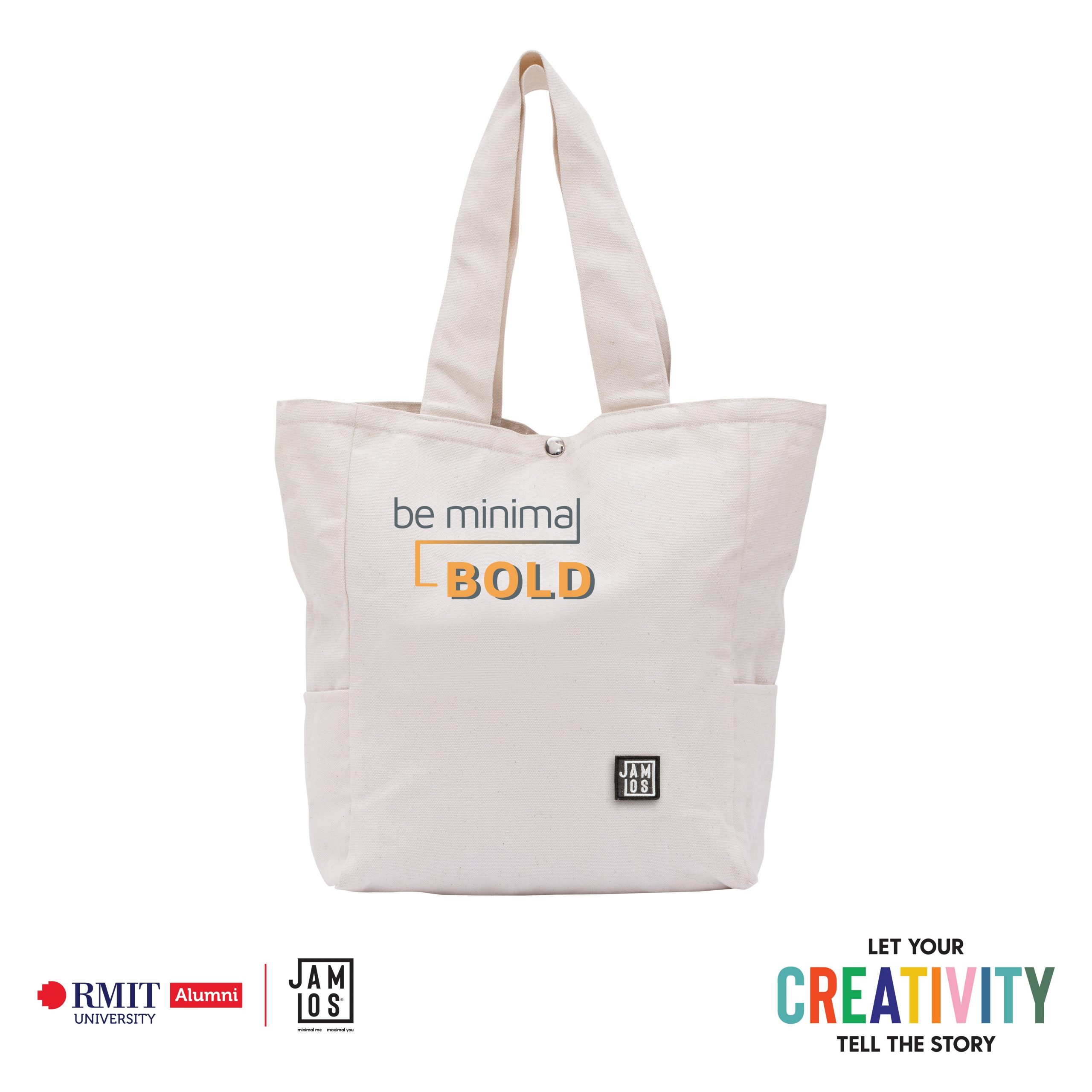
Be Minimal, Be Bold
Typography
When saying minimalism, people immediately think of basic and elegant art styles, black and white colors with the simple lifestyle. But does minimalism have to be black and white all the time? Does it have to be as basic as it is? For me, minimalism is all about choice, about deciding what is genuinely significant to you and your lifestyle. Minimalism is not supposed to be dull; rather, it is about shaping what is actually important to you. As a result, being minimal is the way we become bold, become outstanding, both in our personality and in our lifestyle. This minimalism concept is also connected to what Jamlos is doing, such as how the brand chooses its materials, design, and packaging, which seems basic yet excellent enough to highlight the brand’s core value. The design begins with the phrase ‘Be minimal,’ which implies the concept theme and key value of Jamlos, followed by a draw line from the final letter of minimal to the beginning of the ‘BOLD’ one. In the beginning, the design was planned as ‘be minimal, be bold,’ but it may generate duplicates and not demonstrate the switchover enough, so I added the line to emphasize it. The gradient line was inspired by the J and L letters in the Jamlos name and serves as a smooth transition between be minimalism and be bold. The letter ‘BOLD’ is created with two layers: one in grey to match the preceding objects, and one above in yellow to convey the intensity, the energy of this shift. As previously stated, minimalism is about choosing what is actually significant to us and distracting ourselves from what is not. It is not about changing and seizing our character and lifestyle to a different version, but about focusing on what is valuable to us. After that, we bold it, emphasize it, and express it in our way while maintaining the minimalist concept. This design is intended to inspire individuals to pursue a minimalist lifestyle, one that focuses on what is important and valuable to us and promotes it to a higher level. Minimalism is an exciting journey that is worth driving for, and Jamlos is the ideal place to symbolize it.
Not only PETS but also FRIENDS
Typography
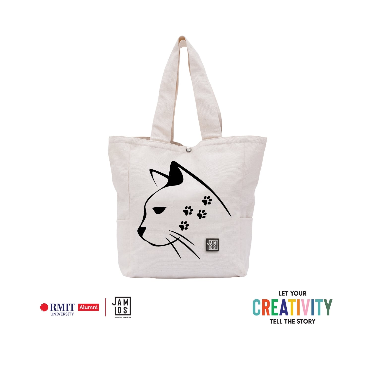
I selected ‘Not only pets but also friends’ for my product’s name. In my opinion, animals in general and pets in particular are our friends. I have witnessed a lot of cats and dogs which are abandoned in parks near my house. They are really lovely, adorable and I want to take care all of them my living condition can only afford one or two cats. Instead, I asked my friends for help and some of cats have been rescued However, there still have a lot of lonely cats and dogs around Viet Nam. I would like to use my idea to raise awareness as well as convey meaningful messages for all people who just claimed that they are the only normal animal. In reality, there are many articles and videos about how loyal dogs are, or how a cat saving an infant from death. It can be seen that these pets consider owners like their whole word and treat us with all their respect. They have sentiment and they always show their love to us, especially cats. This is the reason why I chose a cat face to present my design. When you look at the picture, the first impression is the blue face of a cat. He was sad because of people’s mistreatment. The footprints in his face are symbolized for lacking care and attention about cats, some devil citizens are not only beat cats but also consider them as a food accompanied with beer. I really do not understand why they can do that action which is very cruel. Last but not least, I want to bring this project to everyone and encourage them to protect animals. If anyone do not have enough capability to support pets, they can contact organizations protecting animals.

Bubbly Joy
Typography
What is happy living? It is the feeling of fully enjoying your life, and the desire to get the best of it and we felt that we have a feeling of completeness, gratitude for which we have now. Sometimes our lives might be filled with activities and duties. Many of us are busy, think about where we need to go next. Nevertheless, we must slow down to pay attention to what we are doing, notice the consequences of daily activities, take time to consider what is most important to us, and focus on tiny everyday habits that lead us in a direction. It will give you the purpose of life and increase happiness. When our lives are filled with pleasant emotions, wonderful connections, and have a feeling of purpose, We are ready to achieve things. Happiness is entirely up to us, it is also the “secret recipe” that allows us to be and gain our best. We can see people with optimistic characteristics are easier to be happy. I picked light pink to be the main part of this typography because this pastel colors promote the balance of energies, brings happy moment, positive vibes to our life during quarantine times. I chose the heart that expresses gratitude and love in warm emotions for what we have in daily living. Inside the heart says “Life is only as good as your mindset” which means that the mindset is not fixed. It could be adjusted and adapted to serve life with a greater purpose. Also, it reminds you have to decide to love your life. In a covid pandemic, when the times are hard right now, you must have an optimistic mindset. It’s great if you have the confidence to banish any negative voices in your head. Besides, I created a little round gradient that means the soul is praying and waiting, faith to get over this pandemic as soon as possible. Feeling some positive emotions every day has a significant impact on our happiness and well-being. That is why it is essential to engage in hobbies that make us feel good. Build a good one, and it makes everything in your living better immediately. Be happy for this moment. This moment is your life.

My heart, my choice
Typography
People have different sizes of hearts, why can’t they love different ways? For me, love is unconditional regardless of gender, nationality, age, etc. We have no right to judge anyone but we have the right to love anyone because we are all human and we have feelings and thoughts. With the theme “Happy living”, I think that happiness comes from love, no matter who you are, whom you fall in love with, just be honest with yourself and show your love in the way that you want. The color palette that I use for my artwork is inspired by the LGBT flag, to my mind, LGBT is an admirable community in which people have the courage to open their hearts and be true to themselves. The illustration of the heart is also used by this palette in order to stay consistent with the whole design. I try to draw the typography and the illustration in the simplest way to show that love is, sometimes, not as complicated as you think. With the heart beating fastly in your chest, you realize that you are in love with someone, and if anyone judges you, reply to them: my heart, my choice.
IF (anything happens/ there’s too much on your plate/you need to talk to someone,…)
Graphic design
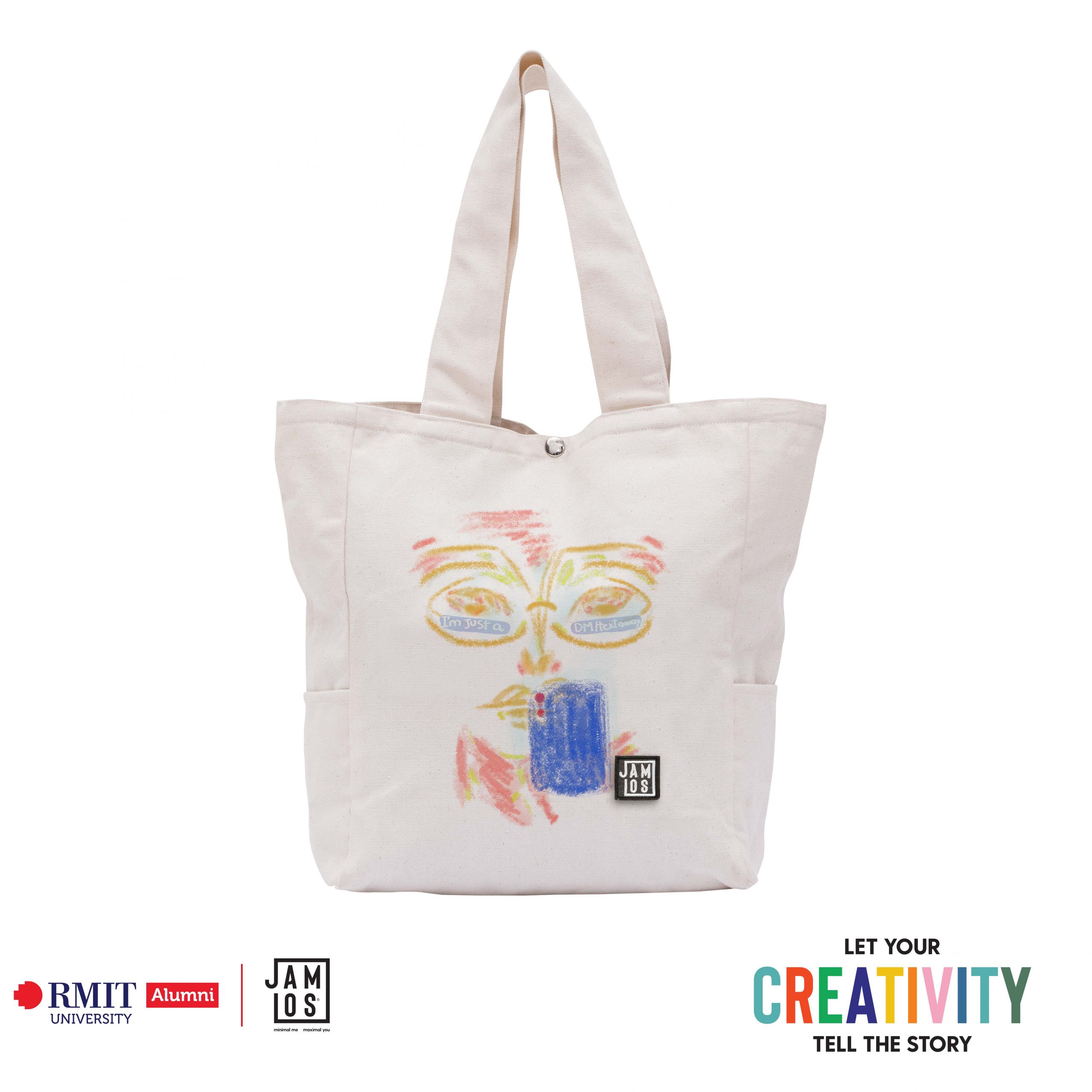
Quoting the most highlighted line (said Amazon Kindle) in the novel “Kitchen”, by Banana Yoshimoto – ‘If a person hasn’t ever experienced true despair, she grows old never knowing how to evaluate where she’s in life, never understanding what joy really is.’ In my opinion, that’s literally the core of growing up or growing old for some people. Nevertheless, to truly interpret what “joy” is, the aftertaste of the surpassed darkness (or just us who really thought that it’d been gone for good) haunts us at times. Ruthlessly, now is that “times”. Staying in involuntarily due to COVID-19, repeating the same routine with limited options of activities (due to COVID-19) sounds like an ideal opportunity for one’s mental stability to collapse. As a member of the “Been there, done that” club, plus, seeing people around me struggling agonizingly gave me the idea to create something that can be considered as an act of kindness and comfort (spread love not hate x). So, why “I’m just a DM/text away”? Bearing in mind our current situation, the only way to get in touch with one another is the digital way, refer to the smartphone and the direct message (“phone call is a no” – said Gen Z) in the artwork. The art direction is to let the text reflects on the glasses, technically, the copy should have been placed in the reflecting mode. However, as I want it to be straightforward and readable, I decided to go against the law of physics :p and keep it in a transparent order. To reveal the full story, the name of the artwork, and the copy make a completed sentence – “IF anything happens/ there’s too much on your plate/you need to talk to someone,… I’m just a DM/text away”. Even though I have learned that “regardless of how forlorn we are, we each insist on standing firm on our own feet” is the best we can ask from the growing up/old voyage, I created this artwork in the hope of carving into the mind (and heart) of whoever will carry this Jamlos tote bag that there is always someone to reach out to on the other end. And that we are not and don’t need to be either mentally, physically, or spiritually alone on this journey.

Street Life of 2021
Graphic design
When mentioning the phrase “Street Life” in Vietnam, we always think about the hustle and bustle of Ho Chi Minh City, endless conversations of people, congestion of traffic, graffiti drawings. All of that was true in the past. The year 2021 is a very special year, everyone still lives, works and communicates but can not go out due to the COVID-19 pandemic. Streetlife from now on is immensely different from the previous. The street is becoming lonely presenting the sad face of the city. Nevertheless, that is just a perspective of human’s view. The amount of gas emitted from vehicles decelerates significantly. Thus environmental quality is enhanced. Cities in Vietnam are now happy in a way that human is hard to see. In my perspective, street life today is still there, it is not faded or disappeared, but is still being developed daily by the consciousness of people. Staying at home is one of the ways to enjoy streetlife, to protect streetlife and yourself. My artwork describes the status of street life in the meantime with thinking of leaving STREET is developing LIFE. Streetlife is considered a culture of Vietnamese people, but it has to be flexible due to the tough circumstances. I hope that street life would come back soon! To do that, we have to protect ourselves first!!!

B a s i c.
Typography
World and situation is complicated enough why not keep it simple?

“I am here for you whenever you need”
Typography
Quarantine time is hard, and quarantine while fighting depression makes it much harder. This artwork of mine is created in honor of someone I used to know. Out of million things, I wish I knew, wish I could do something for her. This is why the sentence “I am here for you whenever you need” means that much to me. What if “happy living” is not about how smoothly your life goes but about how much will people understand your struggle and be there for you? To me, no matter what happens, if I am understood and loved, I’m “happy living”. I chose the shape of a butterfly because it symbolizes transformation, hope, life,… sometimes might even be the messenger from someone from the realms of spirit. You get hurt, you find hope, you change to recover, and you put your life together. Aren’t you creating your own happiness? The white lines repeated from the artwork could be understood as the waves, tranquil with a strength that could ease your mind, or the echo in your head, keeps letting you know: “I am here for you whenever you need”. The pattern used in the typography is from the Blue Morpho Butterfly, intending to remind you that just like those butterflies, you’re beautiful, and you’re rare. By loving yourself, eventually, you’ll find that there are lots of people loving you too, and being loved, it’s definitely a kind of “happy living”.

street nightlife vietnam
Graphic design
Driving along the sidewalk after midnight, you see not just street lights but also store lights, which are all very appealing on a cold evening. This footage, which was aired on RMIT News, depicts a nighttime street scene with a store based on my proposal and a genuine firm. It is based on the idea of street life. The artwork incorporates several design aspects, including there is a lot of asymmetrical balance between the four lights, the four trees, the building block with the bag’s bottom components, and the entire lower half of the bag. Contrasts that are large and little, as well as higher and lower contrasts. Vietnam’s nightlife culture has a plethora of intriguing things to see and places to visit long after the sun has set. The city’s vibrant pubs and glamorous nightclubs are conveniently located throughout, where you can enjoy fantastic songs and various types of liquor while mixing and mingling with fun-loving locals and ex-pats. A night out in Vietnam, however, is not complete unless you lean back on plastic chairs and drink Vietnamese draft beer while strolling around the busy streets. Due to relatively tight rules, nightclubs and pubs typically close around midnight, although you can discover several that remain open and active until the local authorities arrive. Continue reading to learn what to do at night. Eté is the epitome of café bar culture, serving burgers, fresh fruit drinks, and imported beer. Three floors, including outdoor sitting and a karaoke area, are decorated with works by local artists. With a varied population, expect dancing and a lively, stylish environment. Make care to explore all levels, since each one has a distinct design.

street nightlife vietnam
Graphic design
After midnight, you can see not just street lights but also store lights along the sidewalk, which are all quite inviting on a cold evening. This film, which is broadcast on RMIT News, shows a nighttime street scenario with a store based on my idea and a real company. It is based on the concept of living on the streets. There is a lot of asymmetrical balance between the four lights, the four trees, the construction block with the bag’s bottom components, and the entire lower half of the bag in the artwork. Large and small contracts, as well as higher and lower contrasts. Well after the sun has set, Vietnam’s nightlife culture provides a multitude of fascinating things to see and places to visit. The city’s bustling pubs and fashionable nightclubs are conveniently placed throughout the city, where you can enjoy amazing music and a variety of alcoholic beverages while mixing and mingling with fun-loving locals and ex-pats. However, a night out in Vietnam isn’t complete without reclining in plastic chairs and sipping Vietnamese draft beer while wandering through the bustling streets. Nightclubs and pubs generally close about midnight due to rather strict restrictions, however, you can find a few that stay open and busy until the local police come. Continue reading to find out what to do in the evening. Eté, a café bar that serves burgers, fresh fruit cocktails, and foreign beer, is the pinnacle of café bar culture. Local artists’ paintings adorn three floors, which include outdoor seating and a karaoke section. Expect dancing and a vibrant, fashionable atmosphere with such a diverse population. Take your time to explore all of the levels, since each one has its own unique design.
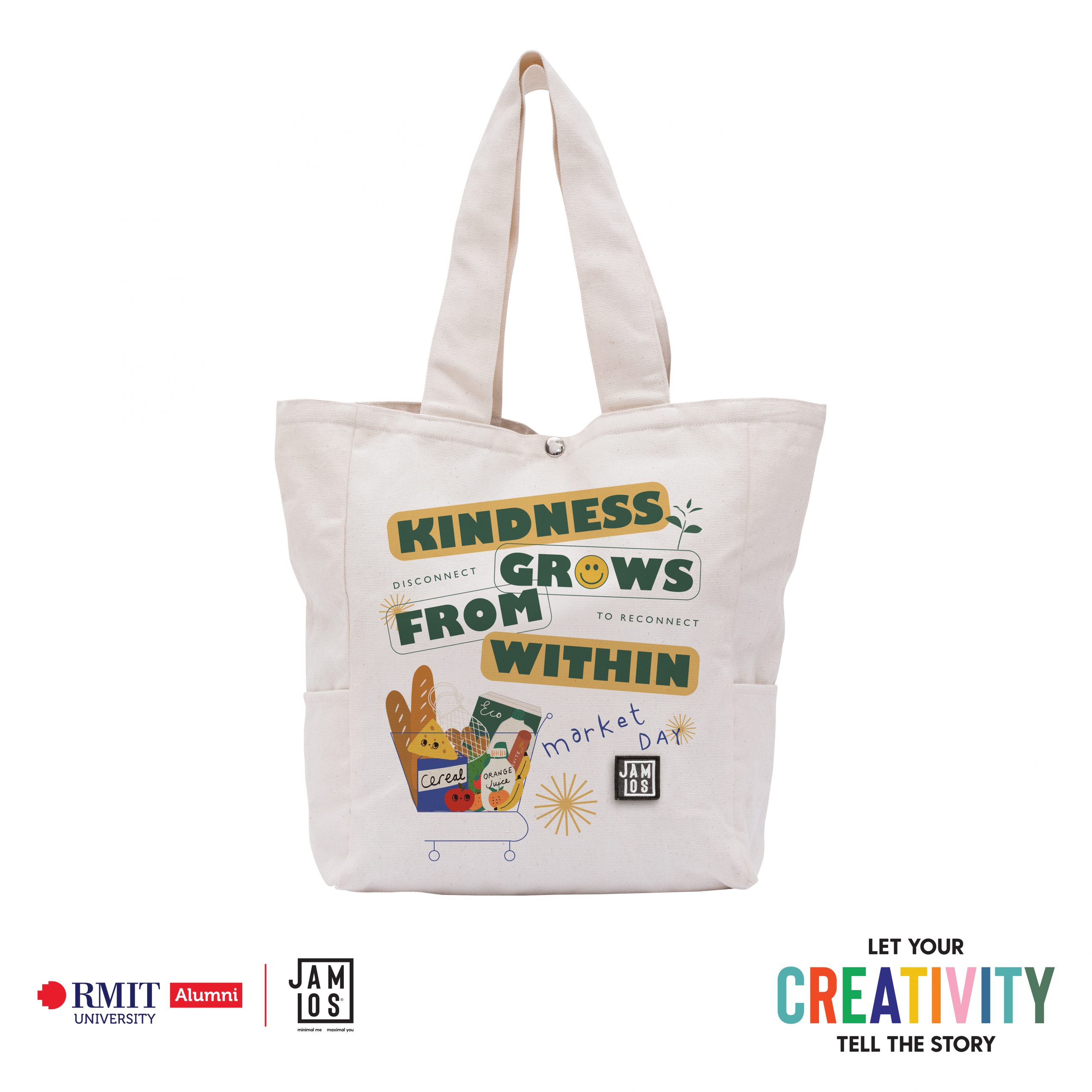
KINDNESS GROWS FROM WITHIN
Typography
Taking the inspiration from the tickets issued by a supermarket to organize shopping time Saigon’s supermarkets are giving customers tickets to schedule their shopping, seeking to reduce stockpiling as the city experiences its worst Covid-19 outbreak. Moreover, in fear of a lockdown, the KINDNESS grows when I saw a lot of beautiful images about spreading love and sharing fresh foodstuffs to the people who have difficulty in red and oranges areas from my neighbors and even the strangers on social media. It is stated that food security exists at all times due to the dietary needs and food preferences for an active and healthy life, according to World Food Summit (1996). Thus, for my artwork, I want to illustrate and express my gratitude and appreciation to all the beloved people that support each other in this hard time. We can overcome together and cultivate the habit of being grateful for good things that comes to us. How beautiful a day when kindness touches it!

The WFH Struggle
Graphic design
Working from home has slowly become more and more of a nightmare, it feels like the entire day just pass by in a blink of an eye as you waste away in front of your computer, then you go to sleep just to wake up and do it all over again. You have millions of emails, calls and meetings to deal with (even more so now that everyone else is also working online and time has no meaning) and the constant technical difficulties can really drive you insane, but you have little means to relief that frustration. And the world just feels like a gloomier place as you’ve lost sight (and hope) of the end of this pandemic as everyday we are faced with increasing number of cases. This is the feeling I want to portray in my artwork, a realistic and honest depiction of what working from home is like for me, and perhaps many other. With this artwork, I want to the viewer to feel related and understood whenever they have these same thoughts. But the thing is that it’s totally ok to feel sad and frustrated, and everyone else is going through the same thing. I had the inspiration to make a 3D design because it’s not something commonly seen and could be something new to experiment with. The design was modeled in Blender and the special effects was added with a composite software. Not only that, the 3D composition also helps create the gloomy and cinematic atmosphere that I was going for. I also love the dynamic movements and angle of objects that is also achieved in a 3D software. All in all, the message I want to send with this design is that you don’t always have to force yourself to feel better and be optimistic all the time. The world can sometimes be a sad, lonely and frustrating place. So, just take some time to feel your feelings, eventually it’s going to be ok again. But if it doesn’t, then that’s fine too.

Sống
Typography
What is the most precious thing in this moment? a freedom, a love or a job? No. It is the living. Fighting COVID-19 is a long and unequal battle. While humans have limited time to survive, viruses are always difficult to determine and variable. To be able to overcome it, we need good health and nutritious meals. Incidentally, a tote bag has a strong relationship with food, a replacement to save the globe. So, why not? According to the bag’s features, I choose Happy Living to follow in the Foods and Meals field. Moreover, positive feelings have 2 levels: Do a good thing that makes you happy and share a good thing that makes people happy. And this is as well 2 main stories on 2 sides of the bag. It is quite different in visual but in meaning, it is the one. This bag has a friendly name: Sống. I chose to name it a very Vietnamese word because this word has a lot of meaning. Which meaning of Song do they understand? A life, living, surviving, lively or the behaviours. Each view will be shown by “Song”. During the pandemic, the users will get happy feelings through a challenge that seems so easy to do or a to-do list that always reminds them when they are buying food. If a user completes a challenge one time, not only the user is happy but the positive vibe also spreads to others. It will make a day better! Or if a user brings “Song” while going to market, a user will have a partner to go with and remind them of nutritious meals. After social distancing, you can go to the market in a pandemic style with “Phieu Di Cho”, from this list you can also make a fancy and nutritious five-star dish. Ticking area in the challenge side which was marked by their own with different symbols each time completed the challenge, makes a user feel better after a normal long working day. And this experience will be completely unique.

“Join meeting now – OK”
Graphic design
First of all, I just want to say that I’m very proud of what I’m doing and I’m happy to describe my artwork to you. I’m a buyer myself and I’m usually looking for totes with great designs that I can mix and match with my clothes so I chose to design on a tote. My topic is “working from home” – for it is one of the latest situations that we have to deal with recently so why don’t we make it positive. Speaking of “working from home”, the first thing that comes to people’s mind is the computer, online meeting, task, chatbox,… so I bring it to the design but with the perspective of a user. In my opinion, this design perspective would have a great effect on the viewers as it catches their attention. The ground-breaking point in my design is the color palette. Blue, white, black, grey,… usually comes to people’s mind when speaking of technology, computer, ipad, digital platform. But I decided to use a vintage color palette including green, brown, light yellow, orange, white because I think it suits the spirit of Jamlos’ theme. I visited Jamlos store on CMT8 street and it gave me a vintage, minimal living, back-in-time feeling so I want my design to represent it. One more interesting point in my design is that I have leaves, circles and curves that suggest a rainbow because I want my design to have a peaceful, happy, positive spirit. Last but not least, I intended to place the last “online meeting” frame to fit the place of Jamlos logo to make this design unique and special to the brand.

“Tui đơn giản là túi”
Typography
Tui đơn giản là túi – I am simply a bag. The artwork is based on the subject of minimalism and revolves around the term “simple.” When your mind becomes confused and you begin to overthink what the content on the bag means, the tote bag begins to speak to you, saying, “Tui đơn giản là túi,” which translates to “I am simply a bag.” At first glance, the word “Tui” (I’m/me) hits your eye first, then you see “đơn giản là”(simply a) makes the acute of “Tui”, the 2 combine and form the word “túi”(bag). As a result, your reading sequence is “Tui đơn giản là túi,” followed by the translation “I am simply a bag.” The logo Jamlos also takes a part in the artwork by being the dot of the letter “i”. Some people will read the English sentence first but it still keeps the context of the artwork. When I was brainstorming ideas for the bag, the logo kept bugging me so I tried various styles to make the logo a part of the artwork, same as the other artwork I just submitted. After many tries I finally got it: I made it the dot on top of the letter “i”. In the beginning I was doing the word “vui”, then switched to “tui” and “túi” after. Many thanks to my family and friends for providing feedback on this and previous artworks.

‘Túi’ Giản
Typography
Strongly inspired by the minimalism lifestyle, I was pretty interested in the theme of Minimalism at first when I decided to take part in the contest. There’s a selection of poetry by Momtaza Mehri, an English poet, named ‘Doing the Most with the Least’, which inspired me with the key subject of my artwork, the text ‘Living the most with the least’. Talking about minimalism, I believe that the quality of every aspect of our life, both material and spiritual sides, can be improved when we focus on valuable things and remove unnecessary things distracting us from our goals. Accordingly, my work for the contest aims to spread a proper and positive spirit of minimalism, we make the most of our lives with the least things, but intentional and essential things. Besides my interest in minimalist living, I also want to spread the message of this content with the most constructive attitude to others in this chaotic pandemic, when we need to save things, stop wasting and share everything together. Regarding my visuals, I would love to challenge myself with typography which is not my strength. The main color of the text is yellow as I wanted to highlight the positivity and powerful energy, however, I kept the artwork with solid and not too vibrant colors to avoid complexity and keep the minimal characteristics. The form of the text looks organic instead of geometric to create a friendly feeling. The key visual illustrated smiling faces which I considered a simple way to express positivity and happiness. About the artwork’s name, I came up with the name ‘Túi Giản’ as I worked on a tote bag, which we called ‘Túi’ in Vietnamese and the content related to Minimalism, which expresses the word ‘tối Giản’ in Vietnamese. And teencode appears to be very trendy on social media nowadays that when you say ‘Túi Giản’, it’s possible to understand the word as ‘Tối Giản’. I supposed that it’s a name named by genZ.

CỨ CHILL THÔI!
Typography
What do I tell myself when I’m stressed? – “CỨ CHILL THÔI!” means “JUST CHILL” During the pandemic, the future seems to be somewhat uncertain at the point and the confidence in our abilities begins to evaporate. Sometimes, no hope is visible on the horizon and I see no gain in the future for our present efforts. During those times, what I can do is keeping faith in myself and being optimistic. Possessing “good mental health” is absolutely the key to combat the negativity that creeps into our emotions. Furthermore, a positive mindset can be practiced by being conscious of your thoughts and reminding yourself “CỨ CHILL THÔI!”, which is the tendency to help you look at the brighter side of things that life puts us in. Therefore, “CỨ CHILL THÔI” artwork is born to remind people to stay optimistic and hope for the best by working with confidence, obstacles tend to fade out.

Sai Gon Dep Lam
Typography
“Sài Gòn đẹp lắm, Sài Gòn ơi, Sài Gòn ơi” – Carol Kim, 1975 When you think of Saigon, the first thing that springs to mind is its culture and how it has evolved through time. Significant iconic parts of Saigon have seen some remodeling throughout the years. It would be difficult to capture the attention of the younger generation with merely what Saigon was and is since it does not appear appealing enough. As a result, the concept of developing a design that is both relatable to previous and present generations came to mind. It is based on the song “Sai Gon Dep Lam,” which has become and continues to be iconic to many and has lately been remixed, making it popular among younger viewers. While maintaining some characteristics of the old Saigon, this style is approachable to a wide range of consumers, especially the younger ones.
No Homeless Cats
Graphic design
The inspiration for this design originated from a written story about an elderly lady who, despite not making much money, would spend her days on the streets looking after homeless cats. The main aim of this tote bag was to raise awareness for cats who do not have access to warm and comfortable homes. The design was created to symbolize the misery and abandonment of homeless cats, yet it can also be viewed as their own uniqueness. And that uniqueness can be considered as their own beauty. When creating this piece of art, that idea was carefully considered, as there was an intention to create a connection between the artwork itself and the homeless cats. With this tote bag design, the homeless cats will always have someone to notice them. This concept could also pave the way for future collaborations not just with cat adoption centres, but also with dog adoption centres with a dog-designed tote bag.
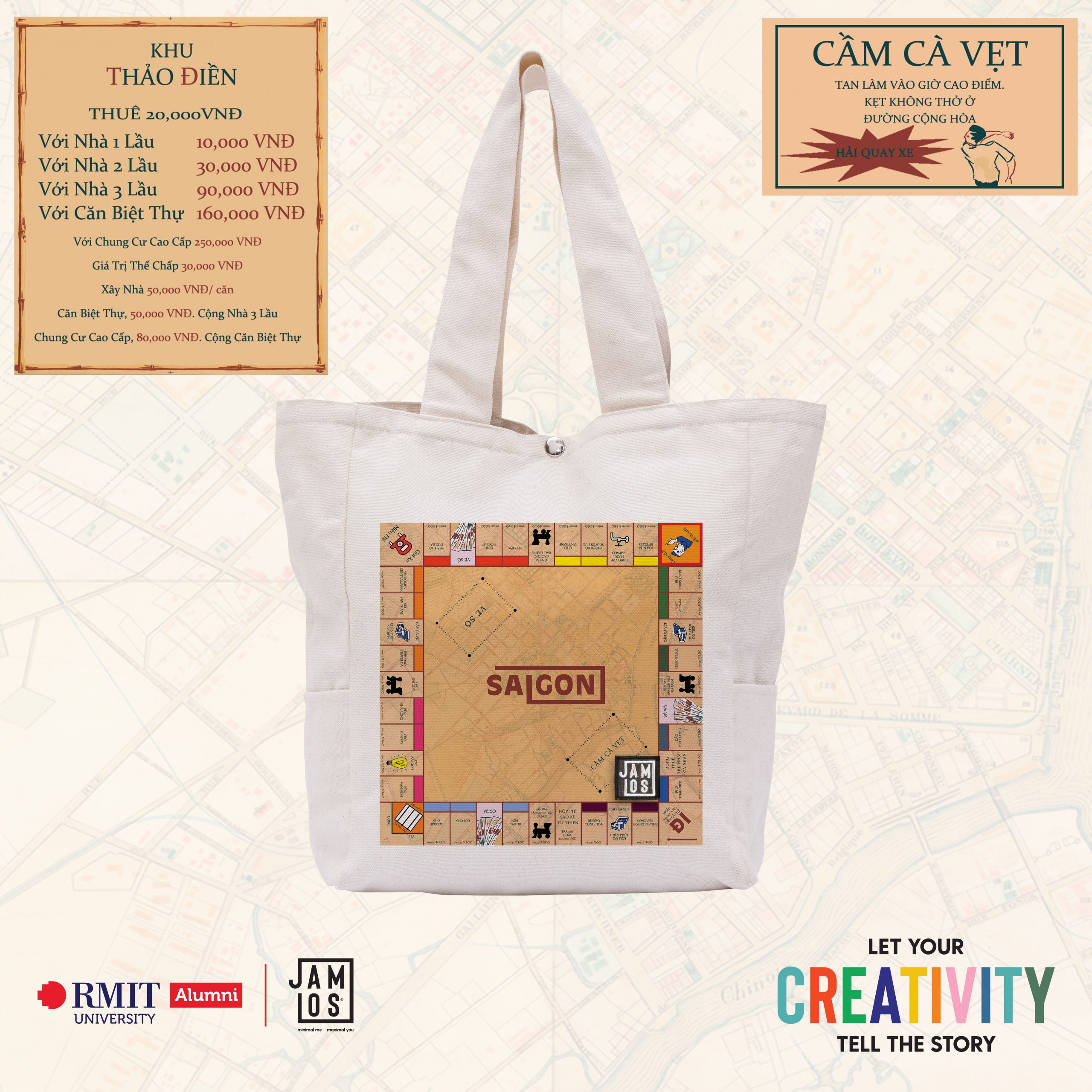
Money Bag
Graphic design
Travelling around Saigon, you’ll notice that the bulk of the city has had its share of memorable experiences and hilarious references, especially among the younger generations. Since the pandemic caused us to stay at home and work, we’ve missed out on many of Saigon’s most famous sights and events. The design was inspired by this, as well as the board game Monopoly, which features some of Saigon’s most famous locations as well as some of the most relatable references for younger generations. It’s small and portable, so you can bring it with you everywhere you go. When you combine it with the thought of never having to worry about not having fun while in or out, you have yourselves a winning combination.

Money Bag (No Guideline)
Graphic design
Travelling around Saigon, you’ll notice that the bulk of the city has had its share of memorable experiences and hilarious references, especially among the younger generations. Since the pandemic caused us to stay at home and work, we’ve missed out on many of Saigon’s most famous sights and events. The design was inspired by this, as well as the board game Monopoly, which features some of Saigon’s most famous locations as well as some of the most relatable references for younger generations. It’s small and portable, so you can bring it with you everywhere you go. When you combine it with the thought of never having to worry about not having fun while in or out, you have yourselves a winning combination.

Productive
Graphic design
The pandemic puts our leisure time at home, and we all have the desire to go outside and perfect ourselves. Some people complain about their boredom to the public that there is nothing to do at home. But being at home is one of the few places that can be as “productive” as being out. There are many possibilities for us to learn and work at home. This is the time we can improve ourselves to be better. Reading or just entertaining is enough for us to keep busy or enjoy something that takes time but is worth doing. Being productive is the way we can work outside the home while enjoying things we love at the same time. I used to think that at home, you couldn’t do anything and that you’d be bored to death. Those mindsets change after I learn how to be productive, which leads to my design. I chose the color mauve as my main background because it symbolizes inspiration and innovation, which are the components of being productive. Finding your hobby or being more direct at work are the cures for weariness.
Dedicated Workspace
Graphic design
Working remotely in the current context is a solution to deal with dangerous pathogens. When you are working at home, it is much easier to get distracted and exhausted. This design took inspiration from the student’s study desk, which is familiar to all of us during this quarantine. Obviously, it’s easy to get high focus when you have an organized working desk. With the central message of rearranging widgets, work logically with the help of Jamlos products to help stimulate hyper-focus. By creating a dedicated space where you do work and only work, you can easily find your flow and stay organized when facing deadlines.

My heart, my choice
Typography
People have different sizes of hearts, why can’t they love different ways? For me, love is unconditional regardless of gender, nationality, age, etc. We have no right to judge anyone but we have the right to love anyone because we are all human and we have feelings and thoughts. With the theme “Happy living”, I think that happiness comes from love, no matter who you are, whom you fall in love with, just be honest with yourself and show your love in the way that you want. The color palette that I use for my artwork is inspired by the LGBT flag, to my mind, LGBT is an admirable community in which people have the courage to open their hearts and be true to themselves. The illustration of the heart is also used by this palette in order to stay consistent with the whole design. I try to draw the typography and the illustration in the simplest way to show that love is, sometimes, not as complicated as you think. With the heart beating fastly in your chest, you realize that you are in love with someone, and if anyone judges you, reply to them: my heart, my choice.
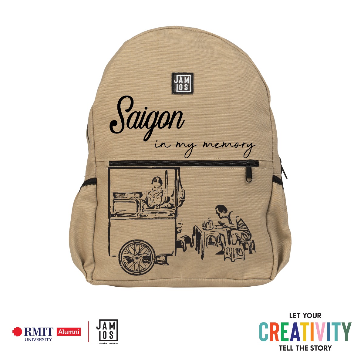
Saigon in my memory
Graphic design
Staying at home all day during the lockdown is jejune, so I rummage through the old boats every now and then. One day by chance I found a family photo album. Sitting down to review the recollections of a few years ago reminds me of my youth in middle school. The days when I skipped school to go out, roam the streets of Saigon, and hang around the sidewalk shops. Especially, I could not forget the noodle shop in front of the school gate, where we kid always amass every morning before class time. So, when I optically discerned the theme “Street life”, the recollections came flooding back and I came up with the design conception for this contest. This design was adumbrated predicated on what I recollect about that noodle shop, with an old cart with a smiling shop owner. By infusing this image into my design, I want the viewers to relive the nostalgic recollections of Saigon in their mind. Some of the vintage and minimal designs from Jamlos are authentically resplendent, and they authentically inspired me when engendering this artwork. The fonts and black strokes authentically highlight the nostalgia in the design, don’t they? Do you have the same “vintage vibe” when optically canvassing this design like I do? Just remember, if you feel bored doing nothing at home, why don’t you lay down and review those old recollections of yours? Maybe you can find something to apportion with your friends or family, too.
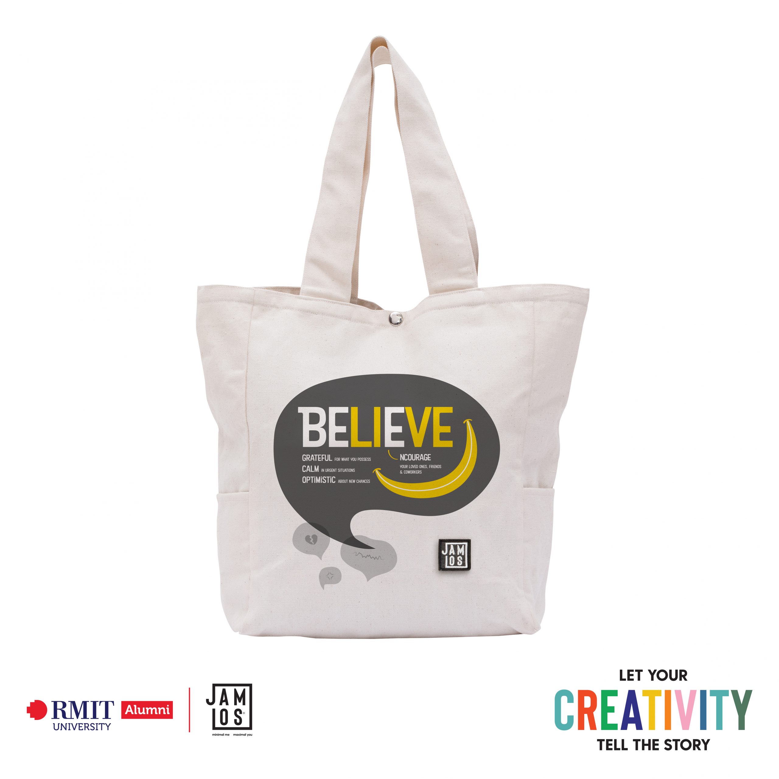
Believe
Typography
Theme: Happy Living. My artwork is centered on the word BELIEVE, as I want to convey the message that we must firmly believe that we will overcome the pandemic and the difficulties that come with it. From the word BELIEVE white, I changed the letters L, I, V, E to yellow, forming the word LIVE. Through this, I want to honor life, and show that being alive is a precious thing and worth fighting for. The yellow swoosh connecting LI and VE forms a smiley mouth, expressing joy. The swoosh was inspired by the yellow curve in Amazon’s logo. My artwork was inspired by the event that my grandfather had to be hospitalized during the epidemic season, due to dangerous diseases. The event made me very nervous and devastated, but I was comforted and encouraged by my family and friends. From the feelings I had, I derive the messages that I use in the artwork, which are: “Be grateful for what you possess”, as the privileges you have are what many people out there wish for. “Be calm in urgent situations”, because calm can give reasonable and sensible solutions. “Be optimistic about new chances”, since you may think of new ways of studying and working. “Encourage your loved ones, friends & colleagues”, because they are also going through difficulties. I want to show that those actions can be done to make this period less harsh, and provide strength to cope with hardships, especially the loss of human life. They are connected to the big word BELIEVE, as personally, belief is the most powerful and encouraging notion. The yellow color is dominant to express optimism and spread positive energy. I use minimalism design style and soft forms in shapes and typography so that the artwork looks harmonious with Jamlos products. In the first iterations, I intended to list mentioned messages in rows. That layout seemed dull and not unique. To make the artwork have layers of seeing and understanding, I set the word BELIEVE as the focal point, and it expands into the messages. That way, viewers have to think, find and explore a little bit. Previously, I used a geometric font for the word BELIEVE and a serif font for the messages to make a strong contrast, but the messages looked too serious. So I put them all in a friendly and soft font for a playful feel. The smiley mouth swoosh helps to make the layout of the text more balanced. After dealing with the statements, I added the chat bubbles. The biggest bubble surrounds my text, the heart of the artwork. Smaller bubbles are below, with images illustrating upset, grief, and hardship happening in the pandemic. The difference in size and contrast between the biggest bubble and the small ones means that we should try our best to prevent negativity from affecting our feeling and value of life during the pandemic or weakening our mental strength. Instead, we should direct ourselves towards positive energies.

All About Balance
Graphic design
Working from home can be exhausting indeed: long working-hour, Zoom fatigue, strange sleeping pattern, and a general sense of disconnection. Yet I and many others (who are so fortunate to maintain a certain level of employment stability in such an uncertain time) have found a chance to re-evaluate our previous lifestyles. I have re-discovered old hobbies, and nurtured new habits: yoga and cardio exercises, taking care of my plants, writing daily journals, reading fictions, cooking new recipes, meditating. And most importantly, spending half an hour everyday talking and joking with my family – having actual quality time. All these activities that I didn’t have the time and energy to foster before in the chaos of a young professional’s life, now has been the center of balance for my daily life. More than ever, I understand the importance of self-care. I wish to maintain this balance for months to come, and I wish the same for everyone.

Dreamy Saigon Street
Graphic design
In the eyes of young people, Saigon is a dream place with many dreams and passions to pursue. In addition, the beauty at night brings a sparkling atmosphere that makes everyone’s eyes look up and be satisfied with what’s in front of them. Purple combined with blue shows that Saigon is a place where many beautiful memories between people are illuminated down the road that everyone passes. That place sparkles with colorful buildings that make up the characteristic of the street named Saigon and brings to mind the eyes of young people Saigon is the place to bring all the colors of the rainbow – multi-color.

Saigon Street Life
Graphic design
Saigon is a beautiful city with such niche building structures that holds historical moments that created a foundation that shaped the city to what it is at the present time. The character that is presented is shown to have worn the Vietnamese traditional ao dai to represent the rich culture with an additional iconic nong la on top of its head. The design was heavily inspired by modern style rap infused with fireworks to create that extra kick factor behind the graffiti.
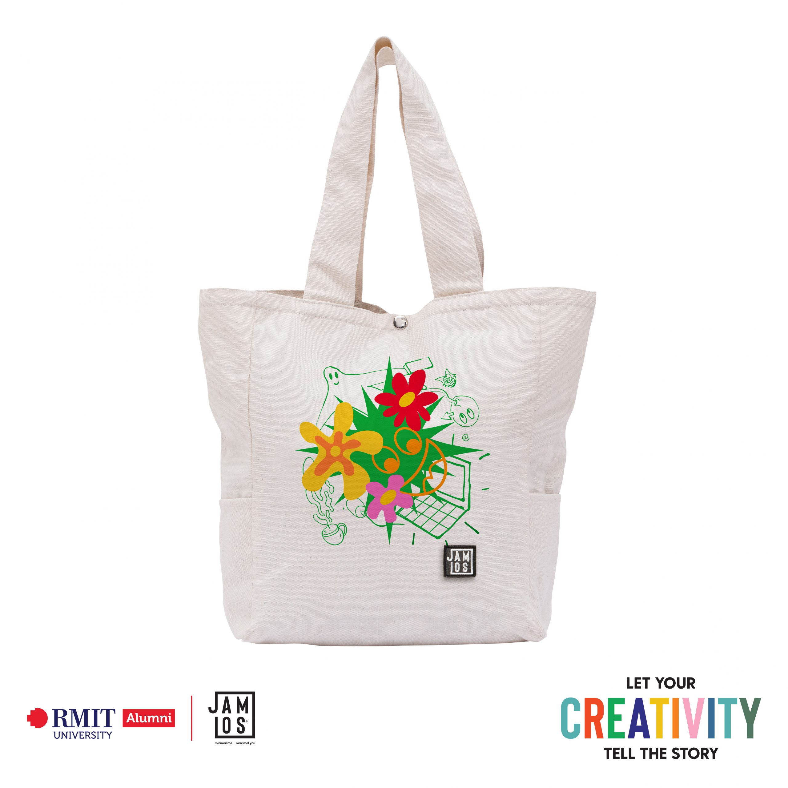
Yayy!
Graphic design
During the pandemic, I have to stay at home. Sometimes I felt very comfortable because I didn’t have to wake up early in the morning and always be in a rush to university. However, I still felt tired and exhausted for many different issues. Most of them came from the overload of tasks and no interaction with others. I was surrounded by four emotionless walls and stuck in one place without going any where. At the end of the day, there were no one beside me in order to share the difficulties. And when I finished all my works, I felt tired and only want to jump to bed. Maybe there are more people than just me feel like we need something to push us up in this period. So I think about the idea that we usually put our bag in the place that we mostly see it. If the graphic on the side of the bag have positive contents, it can make us feel better. Therefore, I make an artwork that have flowers, smiling faces and funny stuffs about working from home from the background. The flower demonstrates the mood-lifting energy and the smiling face would cheer us up. They will be in a group that overwhelm the illustration of working from home to show the feeling that we have finished our work and it’s time to leave it all behind and celebrate for our efforts.

Home: where we show our Love
Typography
In the current perplexed epidemic situation, the most important thing to do is stay at home and keep yourself and others safe. Since we have more time for ourselves and our families, how should we spend them to make ourselves happy? For me, happiness is being with my loved ones, doing the things I loved, and sharing that positive energy through status lines, photos on social media. Such “Happy Life” inspires me in engendering this artwork to potentiate other with positivity thoughts through this competition. Everyone nowadays is talking about appreciate your home, but have you wondered where to commence? First, start doing things that you relish but didn’t have time to do before. That will help you escape from boredom and be productive. Secondly, do something for your loved ones to show your profound appreciation like cooking them a meal, watching TV shows together… This is how you strengthen the bonds between you and other family members. Finally, spread this insightful energy to others around you. This source of motivation both makes you happier and may make someone’s day, too. I hope my minimal, yet consequential design can give your energy a boost to begin changing yourself for the better. So, are you ready? Let’s make your HOME a place where you can let yourself loose and freely show your LOVE.
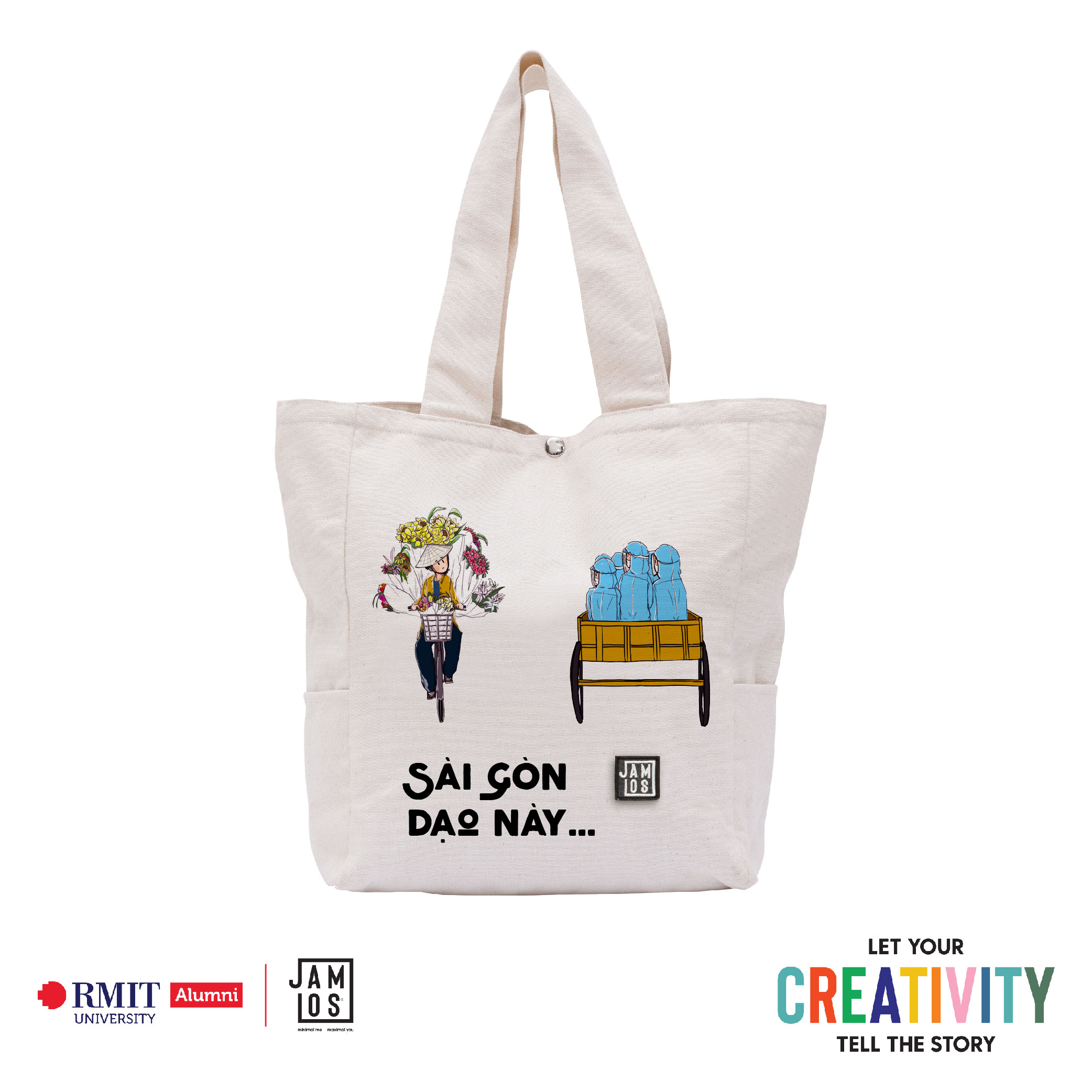
Sài Gòn Dạo Này…
Graphic design
Have you ever walked down the street and realized the seems-to-be unusual-but-not atmosphere these day? How long has it been since the last time you ever seen the sight of people moving hurriedly, heard the sound of people talking, laughing, echoing over the streets? From the wide roads to the narrow alleys, now what only remain are spaces which are empty and lack of human’s warmth. The horrific pandemic has stolen away so many things of life, but not due to that that Saigon would lack the rays of sunlight, the sound of birds chirping. Inspired by the greatest people who are silently dedicating every second of their lives to help us overcome this pandemic – the doctors and medical staffs, I called them, “The flowers blooming in the heart of Sai Gon” as a tribute to their hard work and unremitting efforts. They are, indeed, so much like the fresh flowers on the commonly seen flower vendors in Saigon, brilliantly showing off themselves to beautify this life.”Sài Gòn dạo này vắng những cơn mưa, Sài Gòn dạo này thật vắng hơi người” but flowers will always bloom, the sun always shines, birds always chirp, splendid traditions will always be kept and carved into the mind of generations today, tomorrow, just like the people who are quietly embellishing our lives.